Editor’s note: This blog was originally published in 2018. It has been updated for accuracy and to reflect modern web design practices.
Today, customers expect more and more info about a product before making a purchase.
If your product page design isn’t up to modern standards, you’ll not only be underselling your products — you won’t be giving your customers the information they want to see.
What customers expect from an eCommerce product page greatly depends on the norms set by popular online businesses. That’s why, each year, we analyze leading eCommerce sites across dozens of categories to identify what features and technology they’re using.
In turn, we use that data to recommend best practices to our clients — and (in the case of this blog) to you, our curious reader.
In this guide, using our annual research we began back in 2016, we’ll share the best product page design trends to incorporate into your site, complete with examples from the websites we’ve studied.
(Want to understand how your site compares to online shopping industry standards? Request a free website audit here.)
9 Best Practices for eCommerce Product Page Design (With Examples!)
1. Customer Reviews
User-generated product reviews are powerful tools for your eCommerce business. Almost all shoppers consult reviews before purchase, with longer reviews having a larger impact on overall sales.
In short, reviews are a “must-have” feature when it comes to product page design.
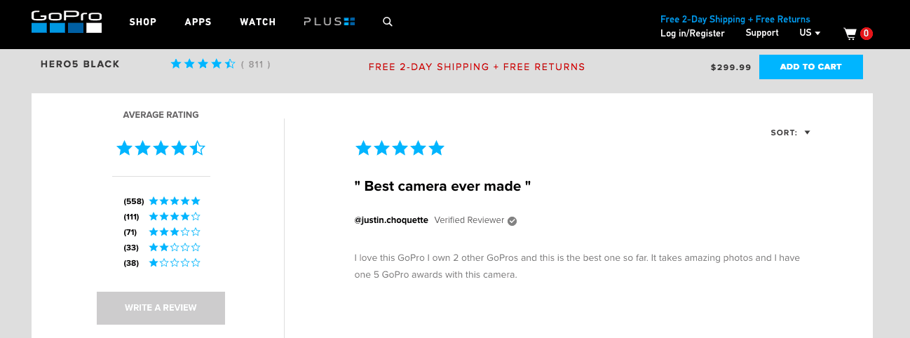
However, implementing a review feature isn’t enough on its own. Your products need to have many detailed reviews to move the needle. If you don’t have substantial reviews on your product pages, it can result in distrust of your product and your brand.
We highly recommend following up with post-purchase emails that prompt customers to leave a review. If you leave customers to write reviews unprompted, they’re much more likely to be negative and extreme — but, if you prompt verified buyers to leave a review, you’ll usually have higher ratings that are more consistent over time.
Tip: Use a syndicated review service to source and maintain your product page reviews.
2. Detailed Product Descriptions
Your customers want to know everything there is to know about your products. Gone are the days of getting away with only listing size, brand, color, and materials. Today, you need to use your product descriptions to sell your inventory at length.
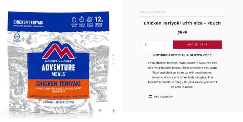
Copying the manufacturer’s description is one of the worst mistakes you can make — not just from a conversion rate optimization perspective, but from an SEO one, as well. Your product pages should include content that’s unique to your site to avoid duplicate content issues. Your descriptions should also be at least 300 words long.
Stuck on what to include? Here are some product details to consider:
- What the product is best used for
- What is or isn’t included in the purchase
- What size the product is or what capacity it holds
- Whether the product is compatible with other items
- What the technical specs of the product are
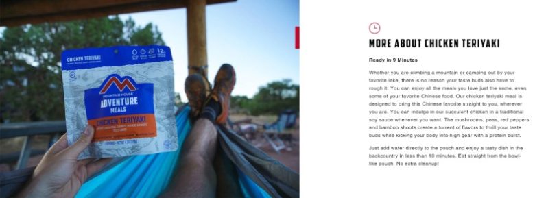
Tip: Beef up your product information with our eCommerce copywriting guidelines.
3. Customer Question and Answer
In addition to detailed product descriptions, make sure to include a Q&A section in your eCommerce product page design.
Your customer Q&A should be a living, breathing aspect of your product page design. It should update over time as customer questions roll in, providing more context and detail to your shoppers.
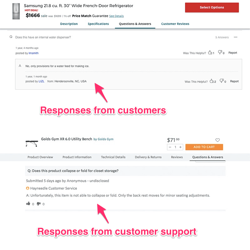
When done well, this feature can go a long way to building trust through transparency and customer engagement. Unfortunately, it’s not often executed well.
To do it right, make sure that your customer support team is answering shopper questions quickly and professionally.
Tip: Work with your customer service team, search through your social media comments, and employ some detailed eCommerce keyword research to identify the biggest questions about each product. Answer them preemptively on your product page to eliminate potential barriers to purchase.
4. Product Videos
Product videos are a great way to show off your unique offerings and give your potential customers another look at the item they’re considering.
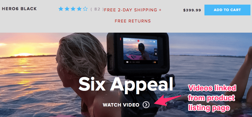
These videos are either embedded natively into the site or hosted on external sites (with either an embed code or a link to that video page). Talk with your development and SEO teams to see which option is best for your site; you want to avoid slowing down your website speed as much as possible.
Tip: Don’t just show off your product in your video; incorporate a how-to and social proof (like testimonials) to help your audiences learn more and be motivated to purchase.
5. Multiple Product Images
You already know every product should have an image. But two images are better than one — and more than two is even better.
Make sure every product page design includes multiple alternative views of the item being offered. For many sites, this requires a “click-through” action for customers to see the next image:
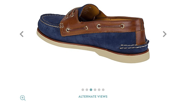
However, a feature growing in popularity is the ability to change the main image displayed by simply mousing over the thumbnail. It requires less work for the user and has tested extremely well with our clients.
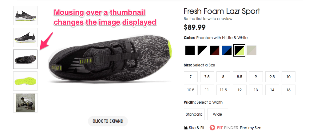
Tip: Avoid using the manufacturer image. Make your product listing stand out in the organic and paid results with unique, attractive product photos.
6. Personalized Cross-Selling
It’s not enough to just add a “Related Products” widget to your product page design. We recommend using personalized language, such as “You Might Also Like” — and putting in the data analysis effort to actually serve up relevant product recommendations for your customers.
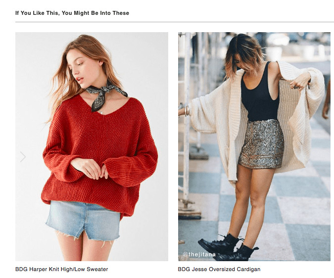
Consider other actionable headings, like “Complete the Look” or “If You Like This, Try These.” Both are more engaging than a simple “Recommended Products” tagline.
Tip: Personalized upselling and cross-selling are best handled via a recommendation engine rather than manually curating different products for each item.
7. People Who Viewed/Bought Also…
Similar to the recommended products widget, the “People who bought this item also bought” is key for your upselling and cross-selling strategies. We recommend using it when accessories are required for an item or when a related product can be crucial to the original product’s success.
Unlike the recommended product widget, this feature is best displayed after an “add to cart” action.
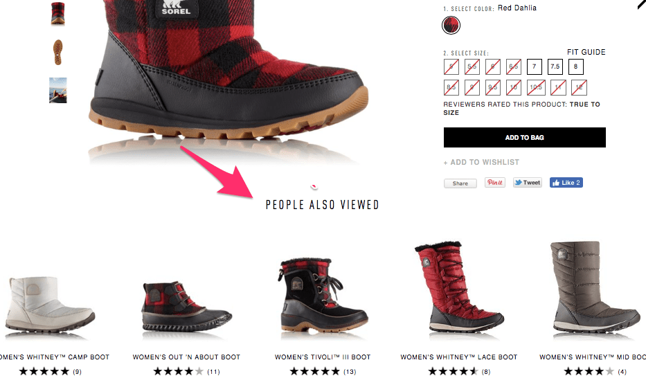
Tip: Avoid displaying products from the same designer or brand in the “People Also Viewed” section. Because these products are so similar, it has not driven sales in our client testing.
8. Sticky Navbars
Another incredibly useful feature on your product pages? Using a sticky, anchored navigation bar that allows users to scroll down or click to the appropriate section — without losing sight of the product they’re originally looking at.
For lengthy product pages (which, as we’ve said, should be the norm on your site), this nav feature helps customers find the information they need, without getting lost on the web page.
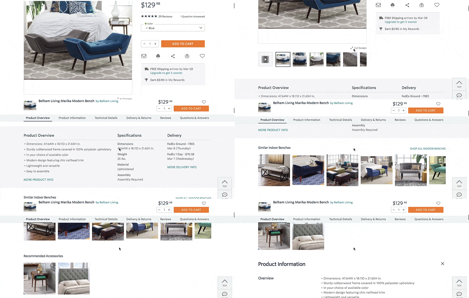
Tip: Be careful with sticky navigation on your mobile site. An above-the-fold header can take up valuable real estate on a mobile screen, so work with your developer before implementing this scrolling feature for your mobile customers.
9. Wishlists
Wishlists (or “save for later” options) are great opportunities to engage those customers who aren’t ready to buy.
Instead of dealing with the dreaded abandoned cart, you can preemptively offer an option that lets your customers think over their purchase a little while longer. (Of course, you’ll always want to follow up a “save for later” action with strategic remarketing emails.)
While it’s helpful from a marketing perspective to “gate” your wishlist actions (that is, require users to login before saving the product), ungating wishlists or favorites will increase their usage, sales, and registrations.
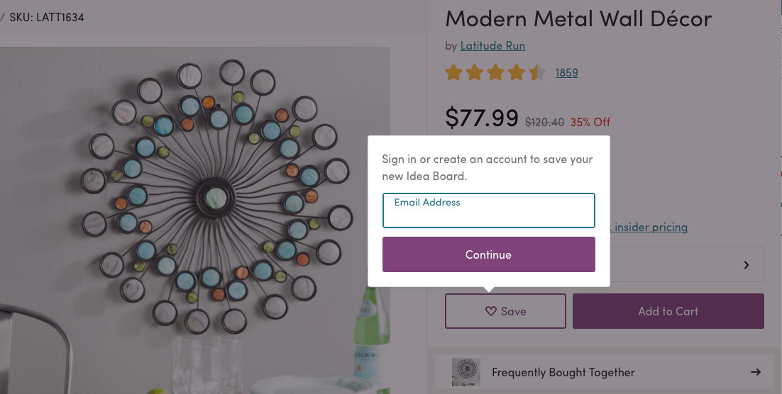
Tip: You can also include “wishlist” CTAs on your gallery and category pages, too.
Test These Product Page Examples on Your Site Now
These 10 best practices for product page design are just that — best practices, not requirements. While they tend to work for a vast majority of eCommerce stores, we always recommend testing them one at a time to see if they improve sales for your business.
Don’t make the mistake of testing them all at once; you’ll never be able to tell which (if any) actually moved the needle for your customers!
If you need assistance creating a custom testing strategy for your online store, our conversion rate optimization experts are always here to help. Request a free site audit today to discover what we recommend for your eCommerce website.
In the meantime, check out our other helpful resources for eCommerce website design:
