
Pop-ups get a bad rap, but that’s when they’re overwhelming, unhelpful and irrelevant. Those kinds of pop-ups can cost you customers, as they get frustrated by the interruptions and invasive shopping experience and swiftly leave your web store. What’s more, Google can also punish your site if it’s deemed to provide a poor user experience by displaying pop-ups that cover up crucial information, or arrive too quickly.
However, when they’re used correctly, pop-ups can be very beneficial, helping to grow your audience, drive sales, improve your customer experience and guide the customer journey. According to BigCommerce, the 10% highest-performing pop-ups have a conversion rate of 9.28% on average. That proves there’s a lot of value to be found in the humble pop-up.
If your fashion web store isn’t using any pop-ups, now is the time to get started. Here are four kinds of pop-ups, with examples of how you can utilize them on your apparel eCommerce website.
Greet your customers & grow your email list
A pop-up upon first visit to your homepage is a great way to greet your new visitors and make them feel welcome. Think of it like how you greet customers in your physical retail store: providing a warm welcome into your space. When this kind of pop-up is combined with a newsletter sign-up CTA and a discount, it can be an excellent method for growing your email list (which might otherwise languish in the footer of your homepage).
Pop-ups that offer a tangible financial incentive perform well, as they often prove irresistible to shoppers. Often they read something like this: “Welcome! Subscribe to our email newsletter and receive 10% off,” or “Stay in the know and receive 15% off your first order.” Even if you don’t offer a specific discount, it can be beneficial to mention that an offer will be available in the future for those who enter their email address. Aerie opts for this approach, with the following message: “SIGN UP FOR EMAIL! Get an exclusive offer when you sign up, plus insider access to even more offers, new arrivals, style tips and more.”
Discounts for first-time buyers have become de rigueur in fashion eCommerce—to the point where brands now stand out if they don’t serve pop-ups featuring some form of this offer, according to the website Glossy, so it’s wise to try it as part of your marketing. And if you’re concerned about coming off as aggressive or potentially overwhelming your prospective customer, you could try an extended timed pop-up that appears only after the visitor has been scrolling or had the website open for a number of minutes.
Drive sales
While the above “welcome” style of pop-up certainly helps to drive sales, there are more direct approaches that your apparel eCommerce brand can take, if that is your top priority. One way that pop-ups can drive conversions is by announcing a sale starting at a certain time, using an animated ticking clock or a countdown to build excitement and provide a compelling visual representation. Uniqlo has an interactive pop-up that presents the opportunity to obtain one of three types of discounts, with the CTA inviting visitors to “Spin to reveal your offer.”
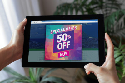
Another tactic is to share a special discount code that’s available for a limited time only or that’s available only on certain popular products. For example: “Save up to 50%, today only,” with a CTA that takes them to a unique sales page.
To achieve even more success with these pop-ups, use personalization to speak to the visitor in a compelling way. Acknowledge and welcome first-time visitors and provide a concise introduction to your brand; and welcome back returning customers and encourage them to check out your newest offerings that have been added since their last visit. Regardless of whether you want to steer them toward hero pieces or new collections, ensure you have a clear CTA that compels them to click. And when you do so, use micro copy below the CTA to tell users what will happen when they click the button. For example: “Clicking ‘yes’ will open another page.”
Improve your customer experience
Sometimes your sales are ticking along nicely and you want to ensure it stays that way. Nurturing your community of customers can take many forms, from customer service to social media and email marketing, but it can also take place in pop-ups.
On your website, install pop-ups that are helpful, educational and supportive. One tactic for achieving this objective is to provide timely and relevant information, or offer personalized help for shoppers who may have questions but not a burning desire to initiate contact with customer service. A simple, friendly and polite pop-up that reminds customers of your store’s extensive size chart, FAQ and/or virtual assistance can go a long way in increasing their trust in you and your products, and build credibility. Meaning, they’ll recommend you to their friends.
The copy should be simple, cheerful and helpful, for example: “Need help with sizes or styles? Chat with a stylist!” or, “Wondering about how to style this look? Talk to a stylist!” or even more simply: “Talk to a stylist.” This could be accompanied by a CTA button that launches a chatbox with one of your customer service and styling associates, or directs visitors to another page in order to connect.
This kind of pop-up works best when it’s delivered as a delayed pop-up, after the visitor has been on a product page for a while. Perhaps they have selected a size and color option of the product, but not added the item to their cart yet. In this case your pop-up would also work toward combating exit intent and cart abandonment.
Guide the customer journey
This form of pop-up is perhaps the most innocuous of all, but no less important. Simple pop-ups that occur when a visitor adds an item to their cart may seem standard and uncontroversial, but they are still worthy of calling out for the crucial UX function they perform. “Added to cart,” “Edit cart,” or “Checkout now” pop-ups all serve to show your visitor that their action was completed and that they are progressing through their shopping journey. Like the “sign up and get a discount” pop-ups, they are very commonplace, yet if your store goes without them it runs the risk of standing out for the wrong reason.
Make your customer’s journey clear and straightforward. Show them their cart’s status, including the number of items and total dollar amount, to allow them to continue shopping without having to leave the page to check their cart’s status. You could add “Continue browsing” to this pop-up message for that purpose. And most importantly, for these and any other kind of pop-ups you install, make sure they work on mobile, as this is how most of your customers are visiting you.
Conclusion
It should be noted that all of these points are subjective, and different websites have different needs and styles. For best results, you should always A/B test to find out what works best for your brand. But generally speaking, pop-ups have become everyday tricks for the vast majority of savvy eCommerce websites, so your web store could likely benefit from utilizing at least one of the above kinds of pop-ups.
InteractOne works with a number of fashion and apparel eCommerce brands to build pop-ups into their websites, with amazing results. If you’d like assistance with building pop-ups into your website, set up a time to talk with us about how we can help you.
Get in Touch
Connect with one of our experts today to discuss your eCommerce needs!
Contact Us


