
Once a customer visits your site, and no matter what page they land on you have three seconds to get their attention and persuade them to stay. Any landing page your apparel webstore creates is a building block of a successful website. Depending on what you sell, organizations you support, your story and other relevant information, you can have many landing pages. While you no doubt know about homepages, product pages and About Us pages, brands sometimes overlook the other pages that can build their brand and help customers navigate through their site. In this guide you’ll learn about the eight landing pages apparel webstores often overlook.
Brands & Designers
As an apparel webstore, you will house many different brands and designers. Customers will search for these specific brands and designers, especially if they are luxury, trendy or sustainable brands. That is why having a brand or designer-specific landing page is important. On this page, you will need to call out all of the brands and designers you carry. While designing this landing page, there are many different ways you can lay it out. Some companies decide to list their brands alphabetically while others list out based on categories.
If you are looking for a design that is simple yet efficient, check out how the Fawn Shoppe sorted out their designers landing page:


Campaign
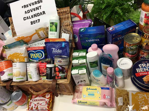
Landing pages do not have to be permanent. Instead, you can have temporary landing pages that go up during a specific campaign or time period. Whether these campaigns are for holidays, collections, seasons, contests, giveaways or events, campaign-specific landing pages will reinforce your campaign messaging when they welcome visitors to your website. Social media, text messages and emails are all tools that can be used to drive visitors to your site and greeting them with an informative landing page will set you up for success. These landing pages can have multiple elements within them, depending on the details and specifics of your campaign. For example, holiday campaigns include many elements, especially if they are working with a charity, having a contest or participating in Black Friday. While creating these pages, don’t forget to stay on-brand, as well as match the campaign’s look. Build your campaign-specific landing pages with consistent design, imagery, video and copy. For more information on how to create a brand guideline to help you keep up with consistent design and copy elements, check out this guide.
Customer Service
Customers are your top priority. Your whole goal is to make them happy. The best way to answer any questions or concerns or to stay in contact with your customers is with a customer service landing page. In many cases, you may confuse a customer service landing page with a FAQ landing page. Typically, a FAQ page is a small section of your customer service landing page that answers your shoppers’ most asked questions. However, FAQ sections do not always answer all their questions, that is why you must have a thorough customer service page to help go into further detail of how to find their answer or how to contact you. The customer service landing page will also encompass shipping and order information, exchange and return policies, size guides, contact information and careers. While you can place the call to action to get to these pages anywhere on your webstore, many companies keep it at the bottom of their homepage. You can also link to your customer service page throughout your website.
Clearance or Sale
It is common knowledge that many customers cannot get enough clearance or sale items. To make the experience for clearance shoppers easier, having a clearance or sale landing page is ideal. While creating this page, make sure to include filters and customization options. This allows your customers to have an easy time navigating through all your clearance. The more customization filters and options you include like size, color, brand, etc, the easier it will be for your customers to find what they want.
Best Sellers
Just like people searching for clearance items, many people are also looking for the most popular items on an apparel webstore. A Best Sellers page is a great opportunity to post about trends, reviews and fashionable items. Customers want to see what everyone else is wearing and buying. Including a Best Sellers page will help connect with these specific shoppers and giving them a landing page where they can browse the top items on your webstore is paramount.
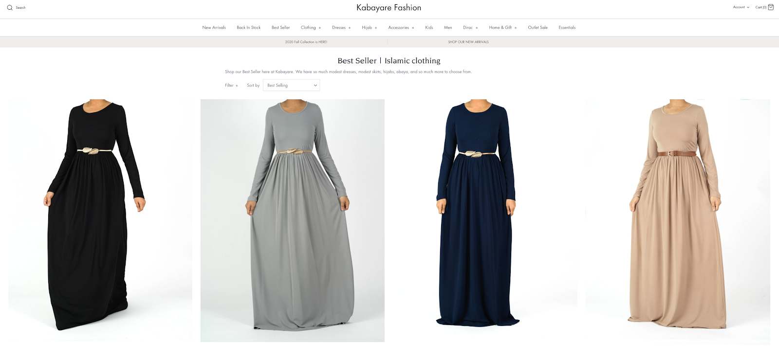
Kabayare Fashion lays out its Best Sellers page very well by including filters and keeping the design simple:

New In Stock or Trending
If you want your customers to be aware of new inventory, a New In Stock or Just Released landing page will help bring awareness to your shoppers. This also allows customers to see that your apparel shop is modern, a brand that keeps up with trends and popular items. Plus, if you have existing and repeat customers, this helps them know when you have new products. Not many webstores include this type of landing page, so if you do, you will stand out compared to many of your competitors.
Account
You cannot forget about an Account landing page, especially if you want customers to keep coming back to your website to track their packages, leave reviews, buy gift cards or sign up for reward programs. This landing page is crucial especially when discovering your customers’ email address, name and phone number. Once you have this information, you can target brand awareness, membership or subscription emails to customers who do not sign up for email. Also, an Account landing page is a customer service portal. Your customer service landing page is for the general public while an Account landing page is specific for each customer. An Account landing page will have a login screen or sign-up screen. From there, your members type in their information to reach their account. In their account, you need to have sections like order information (current and past), profile information (name, address, phone number, etc), billing information, payment settings and any other relevant information.
Additional Pages
There are a few other pages that many companies forget. Other pages that all websites should include are terms of use, sitemap and privacy policy. These types of pages fall under more technical aspects because they help with SEO, copyright and other legal information. While most shoppers never view these pages, as a business, you need to have these pages available and up to date just in case. Typically, the call to action for these landing pages is at the bottom of your website.
Now that you know what pages to include, it is time to start creating them. While many websites have easy to use and free templates, they can be lackluster, not functional and off proportion. These pages can be very ineffective if not designed by someone with experience. A lackluster design can directly affect your traffic and ‘time on site’. The design of a webpage is not just about ‘making it look pretty’. If the colors and segments aren’t balanced, then visitors don’t know where to focus. We do not want this to happen to any webstore. That’s why Interactone is here to help. We have a team of knowledgeable and experienced marketing and design experts who understand the ins and outs of creating any type of landing page or marketing initiative. If you need help honing down your landing pages, social media, emails or other marketing efforts, give us a call today to learn how we can help you.
Get in Touch
Connect with one of our experts today to discuss your eCommerce needs!
Contact Us
