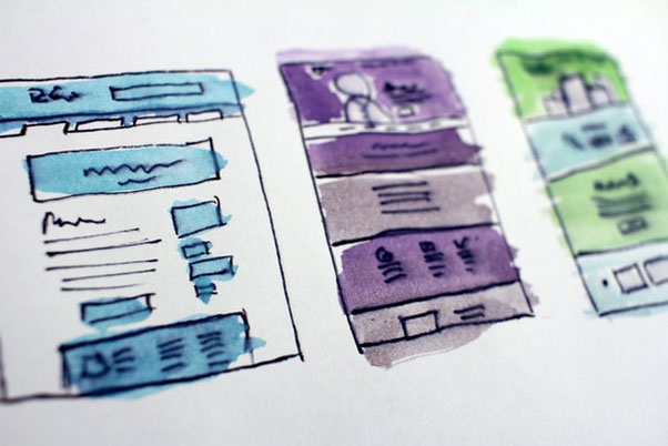
In order to build a landing page that delivers a high conversion rate, you need to be sure your content is in line with the ad it’s linked to. And keep it brief. This landing page should be built for conversion meaning you only give the customer enough information to generate the lead or sale. Let me repeat, a landing page that converts gives no more or less information necessary to make the sale or generate a lead.
That said, there are key points to crafting a successful landing page. Here are some of the main ones:
1. A fierce, attention-grabbing headline – this one is self-explanatory.
2. An appealing sub headline – the sub header is meant to support the headline and give more information.
3. Pictures or video that draw the visitor in – something about a thousand words should go here…
4. “The Goods” – aka the content which delivers a brief explanation of benefits.
5. The Pain vs Pleasure Argument – a quick reminder of what can be gained or lost with immediate action.
6. The Call-to-Action – create an easy-to-find button that supports a click-thru to your website.
7. Misc Info – brief insights on popular products, customer reviews or something unique to your business.
8. A Page Fold – this division should be designed with small screens and mobile tablets in mind.
9. All relevant links and closing information – this is a great spot for mandatory information.
Keep in mind that no two landing pages should look alike. They all have individual elements as they are all looking to appeal to a different audience, with different products and services. With that in mind, check-out the infographic that we have embedded at the bottom of this article.
Clear Call-to-Actions – Before you even begin to design an efficient call-to-actions, there are a few important questions to ask yourself. These include:
1. What do action do I want my audience to complete?
2. How can I make clear, what I want them to do?
3. What will be gained from this call-to-action?
As with the landing page itself, there are many elements that go into a good call-to-action button. You need to think over the format (whether it is text or image based), the clarity of the content, the size and color (needs to draw attention while not being garish), the placement, and the frequency of placements. Make a couple of call-to-action buttons and be sure to test the results with A/B testing to see which styles work better with your specific audience.
