Content and design are two different sides of the same coin; one cannot be without the other. There are many ways that content can be used to create a compelling website, and the same goes for design. Lately though, we’ve seen a shift from the two existing separately and witnessed an interesting co-dependent relationship between the two.
Fusing Data & Content
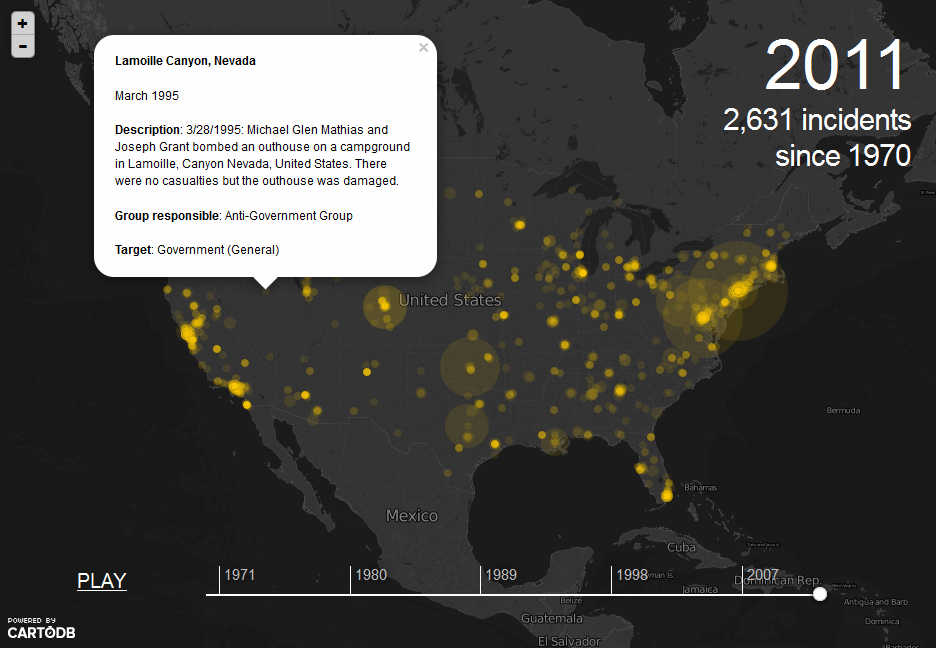
A great example of the intertwining of content in design is on The Guardian’s Data Blog. They come up with some interesting forms of content such as this map of U.S. terror attacks since 1970. Although perhaps not the cheeriest subject, it illustrates this type of content quite well.

The content starts out as a map of the U.S. with a moving timeline that marks the location and intensity of each attack. Once the timeline reaches the end, each individual mark can be clicked on to reveal further details. Check it out and play around with it – the appeal and engaging nature of this fused form of content should be self-evident as it’s a nice little widget, kind of like playing around on Google Maps but with more interesting, or at least specific, content.
This particular piece of content is powered by CartoDB; however Google Fusion Tables is also a popular choice for this type of data driven content. An interesting one, also from The Guardian is this map of smoking rates in the UK, powered by Google Fusion Tables.
Projects & Visualisations
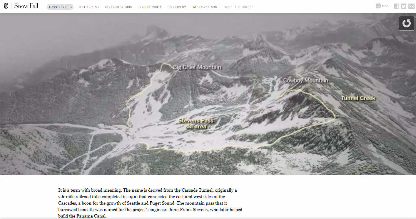
Another way of fusing content and design, in a very profound and visually intense way, is creating projects and visualisations. These form a kind of multi-media publishing or interactive article. A fantastic example of this comes from the New York Times Snow Fall Project – an interactive article about snowy weather in the U.S.

At first you are greeted with a moving background set against the articles title, it’s almost cinematic and certainly lures you in. As you scroll down and read the article, a video presents itself to be played. As you reach the bottom of the page a huge map visualisation, plotting the surrounding snow affected area in three dimensional form imposes itself on the user – it’s jarring, but certainly captivating. It really punctuates the content and makes the design very much a part of it – and vice versa.
These visualisations continue to break up and disperse the content, enhance it even, throughout the whole piece. It demonstrates a level of versatility that goes beyond plain text and pictures to something much richer and more interesting – something that really shows off the power of HTML5 and the devices that use it such as tablets and smartphones.
This type of content is a great way to weave dense content with other things – making it much more digestible. I strongly recommend exploring the Snow Fall project as it is an excellent example of what innovative content and design is becoming.
The kind of work that goes into this kind of content is very extensive. It’s not practical for every bit of content to be projected and visualised – certainly not to the same extent. But a good developer will hopefully be able to incorporate certain elements like data driven visualisations.
At the moment, this kind of content is pretty much stand-alone. It’s like a micro site or project that is best created every once in a while or on exceptional occasions.
Why Is This Content Better?
There are so many kinds of content marketing, and we always try to keep up. But why is this kind of interactive content so good? Well, aside from how it looks, there are several benefits including;
- It makes dense subjects digestible for the user.
- It interacts with a web page, making the content cohesive to the site.
- It makes full use of the power of the devices used to view it.
It’s all about fusing design, development, content and data for a complete content experience.It is simple but effective design that puts content within everything else on site, like a ‘Where’s Wally?’ – the closer you look the more you see. This type of content is enhancing traditional formats like digital press, turning web pages into advanced applications by taking advantage of processing power and fast internet speeds – and it’s hard to argue against the idea that any user looking at it will be highly engaged.
Thanks for reading. If you’d like to see more of my work, please check out my page on the ThoughtShift Blog and follow me on Twitter – @GhastlyChimera
Resources
- http://www.velocitypartners.co.uk/our-blog/the-cutting-edge-of-b2b-content-marketing/
- http://www.guardian.co.uk/news/datablog/interactive/2013/feb/12/smoking-map-england-data-local-authority
- http://www.guardian.co.uk/news/datablog/interactive/2013/apr/17/every-us-terror-attacks-since-1970-map
- http://www.nytimes.com/projects/2012/snow-fall/#/?part=tunnel-creekhttp://www.benjlabs.com
- http://www.bbc.co.uk/historyofthebbc/wherenext/
- http://www.nytimes.com/marketing/prototype/index.html


