No matter how much time and resources you devote to building the most modern, most user-friendly automotive eCommerce website, there are always going to be features that can be improved upon. That’s where A/B testing comes in.
A/B testing comes down to making small adjustments to your website until you find the combination that resonates most with your audience. This means that there are few “ah-ha!” moments; with A/B testing it’s all about baby steps. But be patient, let the testing data inform you, and you will reap serious rewards.
Whether this is your first attempt at A/B testing or you’re already on a never-ending quest for ways to improve your eCommerce site and increase sales conversions, here are seven simple A/B tests to try for your automotive eCommerce site.
Show Your Product Alone or In Context?
Of course, you are going to feature your products with great, high-res images, but what’s the best way to display them? Do users want to see your parts and products as part of the total package, or by themselves against a solid background? There’s a good chance your shoppers will want to see your products in both types of images, and some sites such as Vivid Racing use a mix of both, but A/B testing will tell you if one product image type resonates with your audience more strongly than the other.
Product Videos
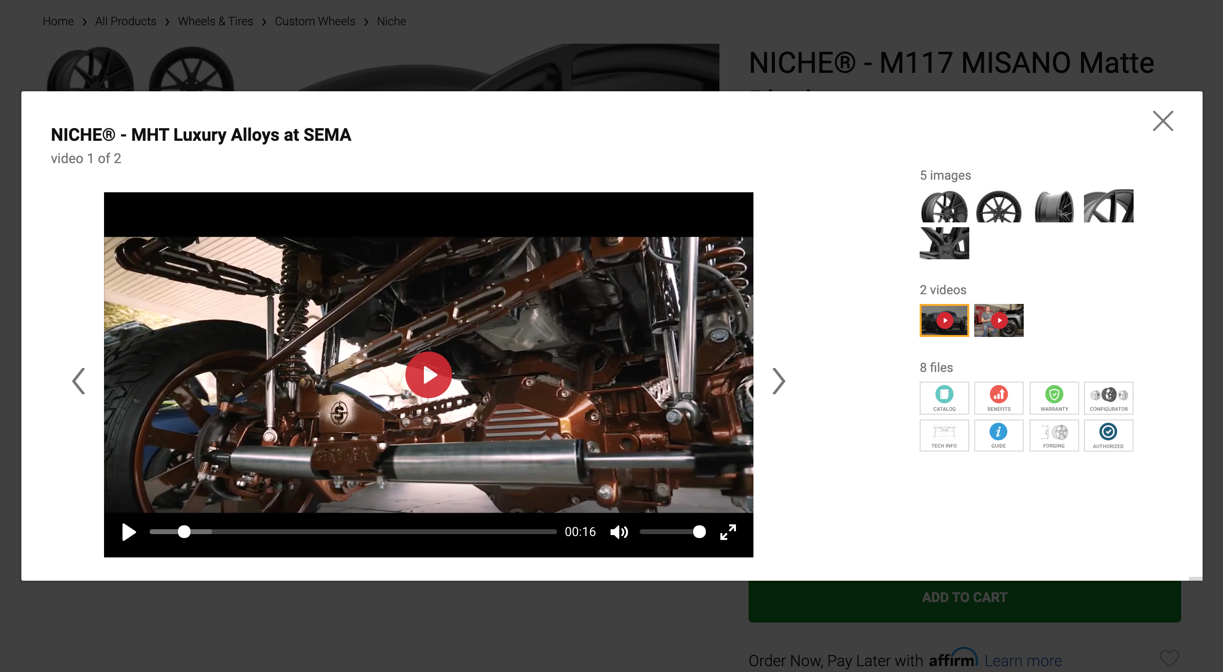
Every single bit of research and data shows that video is the future. Even the most crisp, beautiful high-res images have limitations. Video is as close as merchants can get to bringing their product to life, short of having customers physically hold the parts or products in their hands. If you haven’t yet fully committed to product videos, start with a few for some select products and see how they perform. If you already have product videos, test out an auto-play option and add captions to make it accessible and to catch the eye of customers surfing your site with their sound off.

List View vs Mosaic
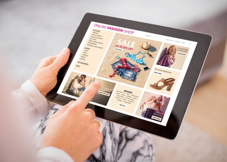
It’s the job of your website to make it as easy as possible for customers to find the right product. But, what’s the best way to organize your products visually? For some, a grid view is more successful. For others, a mosaic produces better results. Try A/B testing the visual layout of your product pages and compare the user engagement for a list view versus a mosaic view. You could also ultimately provide both view options via small buttons above the product results, as CARiD does, if you find that your shoppers respond well to having the choice.
BIGGER calls to action
Customers should never have to search for what they’re looking for on your page. It should always be fairly obvious where they should go for what they need. If they can’t find where to check out or add to cart then your site is failing. Those are the two most important elements of your store and when it comes to those CTAs, bigger is better. But what design, color scheme, and wording on your buttons work best? Test it out.
Feature Contact Information
It may seem like something small, but adding your contact information can have a big impact on your conversions. Relationships are built on trust, and customer/merchant relationships are no different. Customers want to know how to get in touch with you if something goes awry. Try prominently listing your email address, phone number, and (if applicable) physical location across the top of your site and see if your conversions are boosted.

Static Image over Carousel
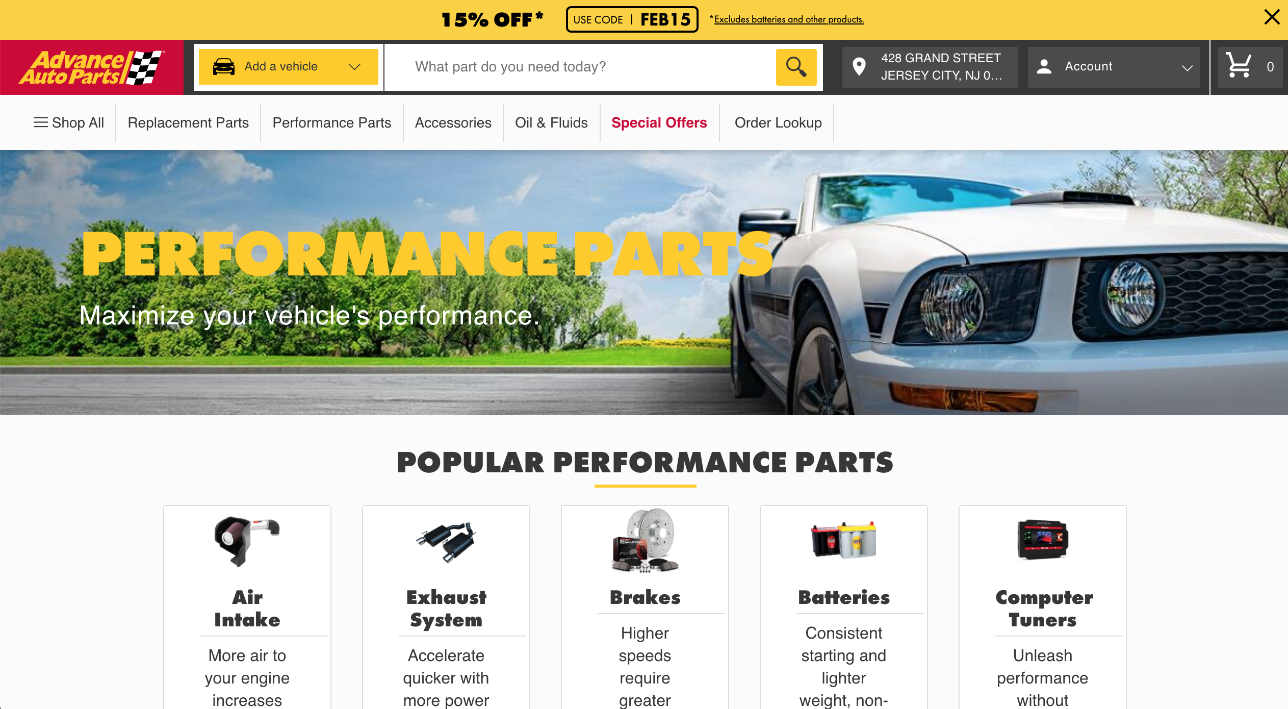
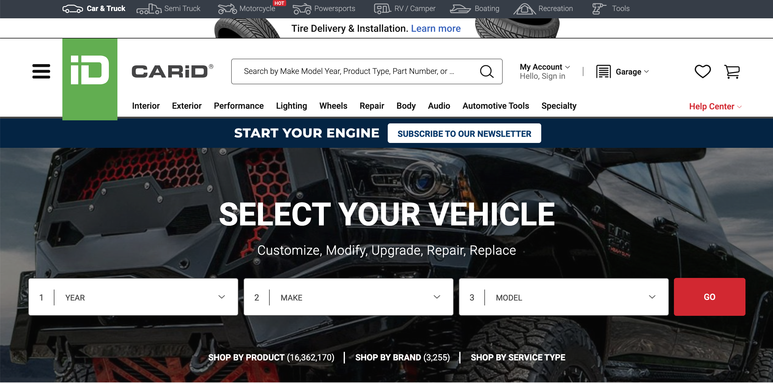
Carousels have fallen out of favor in recent years. Testing has shown they can often be distracting to customers, causing them to overlook details that merchants are often trying to get noticed, such as sales and new products. Automotive eCommerce customers also crave control, which auto-carousels remove. So if you’re using a carousel (banner slider) at the top of your pages, try swapping that out for a static hero image with a single, clear proposition. You may find that one bold image and message resonates more than a flurry of images and options. CARiD’s homepage is a great example, enabling shoppers to immediately enter their vehicle’s details to find the best products for their needs.

Highlight a Price Reduction
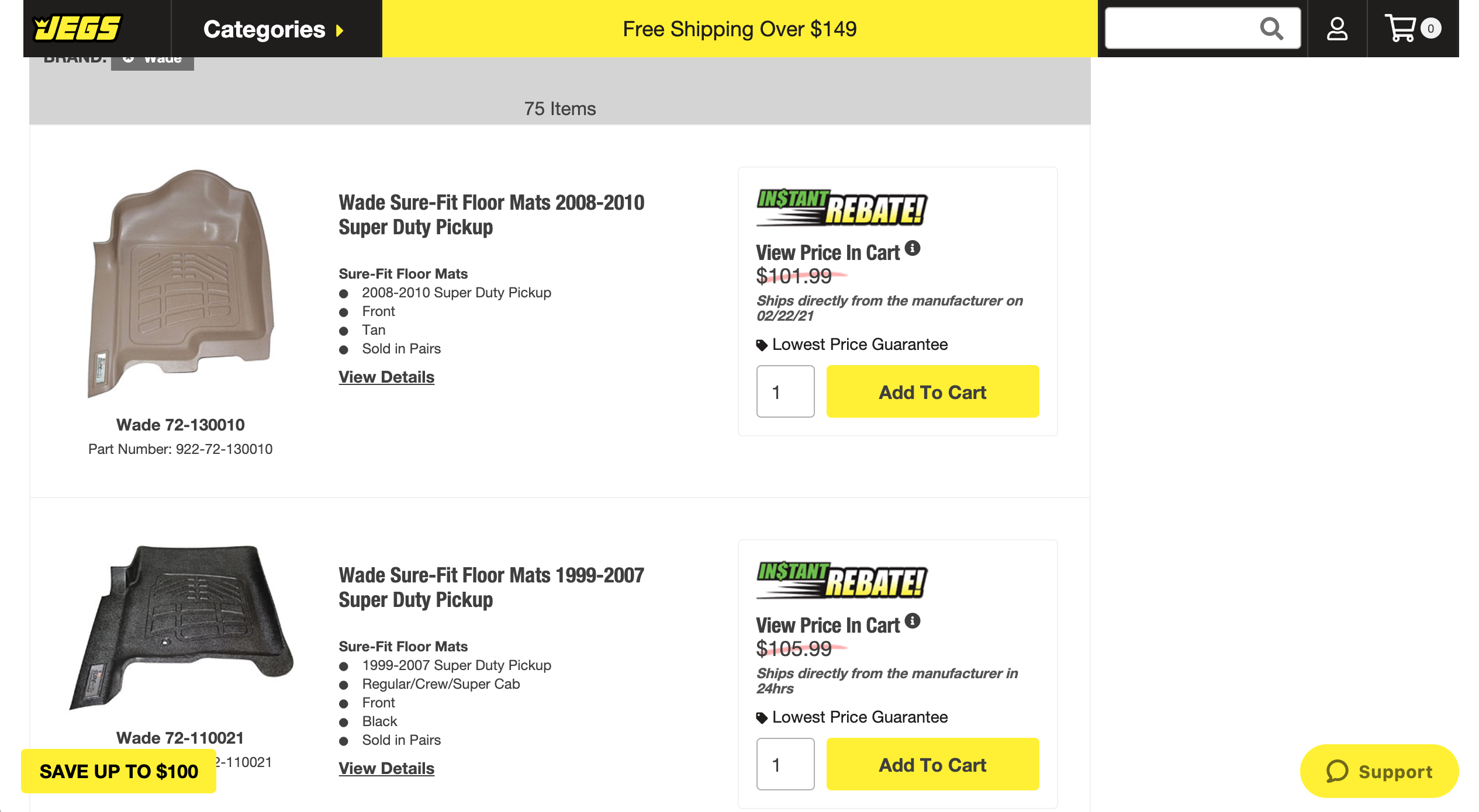
If you’ve recently reduced the price of an item, make sure your customers know about it by showing them visually. But what’s the most effective way to show them? That’s what you need to test. Perhaps it’s a ‘slashed’ price like JEGS uses on their website, different colored text, or an icon on the product image. There’s only one way to find out which works best for your site: A/B test it.

What to Prioritize With A/B Testing
You can avoid costly mistakes with your A/B testing if you know what to prioritize. Here are some things to do and keep in mind as you begin.
Test Your Most Profitable Pages First
Start where the money is. Begin testing on the pages that bring you the most traffic and the most money to build on that success.
Assign A/B Testing to a Single Person
Give one person on your team the responsibility of A/B testing management, implementation, monitoring, and reporting. The term “too many cooks in the kitchen” definitely applies to A/B testing. Keep things simple and empower a single person to handle these aspects.
Don’t Forget About Mobile
Perform A/B tests on both mobile and desktop. Results for mobile can be 180 degrees from results you see on the desktop. What works for one doesn’t necessarily work for the other.
Start Big
Begin by testing the larger elements on your pages; hero images, purchase buttons, product descriptions. Don’t get bogged down with testing the smaller elements until you’ve tested the larger elements and improved those first.
Test a Single Element at a Time
Select one element at a time to test, otherwise, your results are going to be skewed and you won’t be able to determine what elements that are being tested are affecting the page.
Our team has a lot of experience in A/B testing to determine the most profitable outcome for automotive eCommerce websites. If you’re ready to get the absolute most out of your website, contact us and we will be happy to assist you.
Get in Touch
Connect with one of our experts today to discuss your eCommerce needs!
Contact Us


