The idea in your head—that one big idea—takes its sharpest turn from dream to reality once it becomes something tangible. When you can see it, feel it, or hold it in your hands. As a new or aspiring founder, whether you’re turning a hobby into a business or acting on a gap in the market, that moment is when your brand is born.
Your brand is a guide to what you stand for, how you want to make people feel, and the value you bring to the world. Within it lives brand identity—a visual representation of your brand from logo to type to color palette. It is a system of rules and visual assets that guide the creative direction of your brand at every step. It tells a story and invokes a feeling.
As the creator of your business, defining your brand in words may come naturally to you—it’s an idea that you live and breathe every day. But when it comes to branding design, this is where many stumble. Design requires a specific skill set, knowledge of specialized software, and an eye for the craft.
Your brand is a guide to what you stand for, how you want to make people feel, and the value you bring to the world. Within it lives brand identity—a visual representation of your brand from logo to type to color palette.
New business owners may not have the budget to hire a designer to create a complete branding package. Many choose to launch, therefore, with a DIY version of a logo and a preset website template. There’s nothing wrong with this approach, and with a few free tools and tutorials, and advice from seasoned pros, you can create something that truly represents your vision.
Here, we chat with Shopify Product Designer Skyler Hestnes to get her take on how to pull off DIY branding design—with zero budget and no design skills.
Brand, branding, and brand identity: what’s the difference?

First let’s make sure you can talk the talk.
The term “brand” often gets confused with “logo.” While a logo is part of a brand identity, which is one component of a brand, your brand is so much more than a symbol or wordmark.
Let’s look at one of the most recognizable brands: Nike. The Nike swoosh is the business’’s logo mark, but its brand is what you feel when you see it. Nike’s brand storytelling centers the customer as an athlete, depicting regular people achieving physical feats and beating odds in their expensive, sexy ads.
The company has remained consistent with this story across social media and other marketing channels. Because of that, the simple swoosh is all you need to understand the brand.

Branding is the action you take to answer questions like: What does my brand offer? What do I want people to feel when they engage with my brand? Why should people care about my mission? What are my values? This branding exercise will culminate in a clear picture of your brand, including your mission, strategy, brand story, and brand identity.
Brand identity is the visual representation of your brand, from your logo to your photographic style to your color palette. It is a system of rules and visual assets that guide design decisions across your website, social media, packaging, and more.
Branding design glossary 🎨
Here are a few more terms you may encounter as you build the visual identity for your brand.
Logo
Your logo is a graphic representation or symbol that identifies your brand. It can be a wordmark (sometimes called a logotype), meaning that it is primarily text or an icon (or logomark) that is an image or graphic with no type. Your logo may include both graphics and text and you may also have a secondary simplified version of it (think full Nike logo versus swoosh alone) for certain applications.
Color
You will find a lot of terminology around color as you explore design tools or work with designers, web developers, or printers. It’s important to understand these so that your color translates across print and digital.
Color profiles built into design files are used for different applications: CMYK for print and RGB for anything that will be viewed online.
Color systems or codes help translate your color palette across applications. Pantone colors are universal and keep color consistent across print, manufactured goods, etc. HEX is a numbering system that is used to identify colors for web design and in design software.
Typography
Typography encompasses fonts (or typefaces), as well as how the type is spaced, arranged, and designed. You can use free or standard fonts or have one designed to create your wordmark. Your brand guidelines will include a suite of fonts and typography rules that you will use consistently to represent your brand.
Brand guidelines
A comprehensive set of brand guidelines will cover everything from voice and tone to hiring practices. Within brand guidelines will be your style guide that will include your typographic system (a suite of fonts) and color system (or palette).
Image file types
You will work with two main types of image files as you embark on your branding design journey: vector images and bitmap images.
Vector images are made up of paths (or lines) rather than pixels, allowing them to scale to any size. SVG, AI, and EPS are common vector file types. Vector images are typically used to design logos or graphics within design software and are used by printers but generally are exported to a bitmap format for use online.
You may be more familiar with bitmap images—JPEG, GIF, and PNG. These are made up of pixels and therefore have limitations for scaling. GIF supports animation, PNG allows for transparent backgrounds, and JPG lets images be optimized to a low file size for web use.
How to design a brand identity with no skills—and no budget

Branding design on a $0 budget demands a DIY approach, but if you’re not the creative type or have never used graphic design software, the task may feel daunting. Thankfully, more and more simplified tools are emerging to help non-designers get creative.
If you’ve ever used the tools in Instagram to add text and GIFs to your stories, you have enough skill to make a logo.
If you’ve ever used the tools in Instagram to add text and GIFs to your stories, you have enough skill to make a logo! And remember, your first logo doesn’t have to be your last. Once you have the budget, consider hiring a pro for a rebrand.
Later, we’ll provide resources and links to help you discover free tools to get building. We’ll also hear from Shopify’s own Ibrahim Hasan, a self-taught design enthusiast and resident Canva pro. But first, we need to cover some ground rules.
7 branding design dos and don’ts from an expert
Skyler Hestnes spends her days at Shopify as a product designer. She has also worked with numerous clients to design logos and branding packages for their small businesses. While she’s an advocate for hiring a pro to handle this important aspect of building a brand, she also touts some free tools as being excellent backups for those with no budget.
Here are Skyler’s dos and don’ts for designing your brand’s visual identity.
✴️ DO keep it simple
“Sometimes a simple wordmark—instead of a big fancy logo—really does the job,” says Skyler. “Especially if you’re just doing ecommerce.” She suggests using an app like Canva. It’s a free tool (with optional paid pro accounts) that has desktop and mobile versions. “Canva recommends awesome fonts,” she says. Pairing a great font with your brand name and sticking to a simple palette of colors is an easy option for those with little to no natural creativity.

“The most simple, modern logos tend to do really well with customers,” says Skyler. “One issue I see the most is logos that are very busy with lots of color and without any refinement.” Even if your style is more traditional or retro, think modern in terms of stripping back the detail, simplifying shapes, and limiting color. Test the logo in black and white. Does it still work?
That said, don’t get caught in the trap of following what’s trendy if it doesn’t jibe with your brand. If your brand is loud and bold, your logo and colors should communicate that. Just ensure that your design still has enough refinement to work in multiple applications.

Omsom, a brand concocting pre-mixed Southeast Asian and East Asian flavor packs, aligned its visual identity to the founders’ “rowdy spirit.”
“In a world that’s obsessed with minimalism, Omsom has been able to take the concept of maximalism and make it their own in a way that captures their fun and energetic voice,” says Shopify’s Ibrahim. “They’re a good example of how you could achieve an approachable brand without overcomplicating your design.”
✴️ DO consider versatility
“Having a logo that you can work on a white background or a black background, or anything in between, is something that is going to take you near and far,” says Skyler, “especially when you’re starting out.”
Secondary to simplicity, versatility is your friend. Your logo should work in a variety of sizes—scaled up to a billboard or down to a garment tag—and on a number of surfaces or applications, from digital to tangible.

“If you start making sweatshirts, could the logo work on a tag? If you’re doing candles, can you make a stamp out of it?” says Skyler. Can it work in a relief (like a wax seal)? Can it work as a single color? Skyler also suggests developing a versatile color scheme that works across web and physical products.

⚠️ DON’T dilute your brand
“The biggest issue that I see is that brands will have a logo but represent their naming in a different way,” says Skyler. Say you have a wordmark logo but you have your business name appear in a different font in some of your communications. “Now you’re diluting the brand. You’re ruining the reference point that people have.”
While you may have a couple of versions of your logo or a palette of colors that you interchange, be sure that you’re creating a pattern that is recognizable to customers across platforms.
✴️ DO research competitors and brands you love
When you’re looking at a blank canvas, it can be difficult to know where to start. Even seasoned designers conduct research and seek inspiration before starting any branding design project. “I would recommend looking at what competitors are doing,” says Skyler. What font styles are common for your industry? Are the logos more typographical or illustrative?
“It puts people off if they walk by, let’s say a sushi place, and the font looks like it’s for a day spa.” Understanding the space in which you’re launching means you’ll avoid ending up with a brand design that is tonally off. “But you can still push the boundaries and try new things within that realm.”
I would recommend looking at what competitors are doing. It puts people off if they walk by, let’s say a sushi place, and the font looks like it’s for a day spa.
Skyler Hestnes
Look to local brands (what resonates where you live) but also larger aspirational brands. “Glossier is one that just always stands out to me,” says Skyler. “They have that big G, they have their logo type, and that’s it. Sometimes something flashy and colorful isn’t really needed.”

✴️ DO hone in on a color palette
Deciding on a palette of colors will help keep you consistent through many business decisions, like building a website, developing products, and posting on social media. “Just say you have five colors,” says Skyler. “You have a couple lighter background colors that work as neutrals. You have a pop color and then some complementary colors. The pop color is your brand color.”
Consider a pop color that also works as a shade or tint of itself so that it can be darker or lighter to overlay text.

This isn’t to say that you can’t use any colors but the five you’ve chosen. Take Big Bud Press, an ethical clothing brand from LA that manufactures a rainbow of vibrant jumpsuits, overalls, tote bags, and knit basics. The brand’s products come in a wide range of colors that might make you think there’s no real brand color scheme.
But look closely and you’ll see that anchoring the rainbow of sweats and bucket hats are a couple of consistent choices. Big Bud Press’ signature vintage-y oranges, golds, and ochres thread through website colors, its Instagram grid, storefronts, and its sunshine logo.


⚠️ DON’T rely too heavily on your logo in your social marketing and content
“Largely with ecommerce, your first touch point with someone is typically on social media,” says Skyler. “On Instagram, people get used to your brand on your tiles where your presence isn’t your logo.” Your logo may appear as your profile icon or be dotted throughout product photos, but where your followers get a sense of what you’re about and your visual aesthetic is through image choice, colors, subject matter, and how it’s all put together.
If your brand guidelines and style guide are tight, and you’re bringing consistency into your feeds, your logo doesn’t need to be the star.
“Your logo doesn’t need to be at the forefront like it once did for brick-and-mortar stores,” says Skyler. But your brand identity should still be cohesive across platforms, even if the type of content differs. “Say you have a TikTok where you create content talking about your process but it doesn’t perform the same as Instagram. The two should be connected in some way.”
If your brand guidelines and style guide are tight, and you’re bringing consistency into your feeds, your logo doesn’t need to be the star. It’s still an important element to have, but it has its place.

“If you look at Glossier’s Instagram feed, it’s more people and experiences, less product,” says Skyler. “It looks like they have defined a strategy of how they’re talking about themselves in a cadence.”
✴️ DO stay consistent
While your logo shouldn’t be altered, it can be used in creative ways: isolate the capital letter, apply different textures to it, etc. “There’s so many things you can do, but you stay united with your colors and your brand so that it carries through everything,” says Skyler.
Brand recognition is important, she says. It’s something you can achieve with consistency and training your fans to know your aesthetic. “The brands that need the most TLC are the ones that aren’t united,” says Skyler. Consistency is also important between your brand and the products you’re selling. “If you’re selling very neutral colored candles, you don’t want a brand that’s red and blue or bright and crazy. Make it fit.”

Tools and resources for DIY branding design
A number of free and low-cost tools and options can help you pull off a DIY brand identity that looks professional. Skyler recommends using a tool like Canva, Hatchful, or a comparable simple logo maker that has built in templates, fonts, and design elements.
“There are a lot of free SVG files online,” says Skyler. “If you have a hair care brand you can just Google ‘hair brush SVG’ and pull it into Canva to make it your own.”


🛠 Design software and tools:
3 Canva tips from a DIY designer
Ibrahim Hasan is a Senior Manager, Editorial & Merchant Storytelling at Shopify. While he has no formal design training, he uses Canva to create quick and professional-looking graphics to accompany his written work. Here’s what this self-taught design enthusiast has learned from his experience with the tool:
- Make use of the Canva brand kit. “Canva Pro users can build a brand kit within the tool, complete with chosen brand colors, fonts, and other elements, like logos,” says Ibrahim. “This comes in handy if you’re working with a team or need to create a lot of assets with consistent branding.”
- Use Canva brand codes. “You’ll find a wide range of illustration styles within Canva,” he says. “If you’re looking for brand consistency, you can search for elements that are similar or made by the same designer using brand codes.” These codes can be found by clicking on the three dots icon on your chosen element. More info about the element, including the designer name and code, can be found here.
- Dedicate time to browse templates and elements. “The selection can be overwhelming, so take your time exploring everything the tool has to offer before you get serious with it,” says Ibrahim. “Make note of what you like and save it for the next time you need to design something in a pinch.”
Canva Pro users can build a brand kit within the tool, complete with chosen brand colors, fonts, and other elements, like logos. This comes in handy if you’re working with a team or need to create a lot of assets with consistent branding.
Ibrahim Hasan
Branding design education and tutorials
While there are many paid courses to learn graphic design and branding design, if you’re resourceful you can gain a lot of knowledge through free content. “Most educators have to have some level of free content in order for people to buy into the paid,” says Skyer.

Even as a professional, Skyler often consults TikTok and YouTube for tutorials on achieving a certain effect. “Anytime I’m trying to understand how to do something, I search on YouTube and it ends up being a scavenger-type of method. It’s not always the same person that I go to.”
🎥 Here are a few pros to start with to get your creative juices flowing:
Branding design for small budgets and rebrands
When you’re ready to level up, you may choose to redesign your brand yourself with more advanced tools like Adobe Creative Suite, Pixelmator, or Canva Pro. But as your business grows, it may be time to consider setting aside a budget to hiring a pro.
Branding design is best handled by the experts if you truly want a professional face for your brand and a logo that scales across multiple uses. It’s perfectly fine to launch with a DIY logo, but when you’re ready to work with a pro, Skyler offers some advice.
How to work with a designer to create a brand identity
If you have a small budget, Skyler suggests focusing on a few key items that are versatile and that you can carry through a number of use cases. “For ecommerce, I would start with a logo,” she says. “Secondly, ask for a good color scheme that can scale.” Here, she means that the color palette is versatile enough and can expand into tints and shades, letting you combine them in countless ways.
With these two things, you can go a long way, mixing and matching colors and playing with logo size and positioning to bring consistency across your brand, packaging, website, and social.

Skyler also suggests asking for a few branded templates that you can reuse over and over in your content and marketing. “Ask them to come up with a repeatable template for wherever your largest touchpoints with your customers are,” she says. “If it’s email, that would be an email template.” If you mainly interact with your brand’s fans through Instagram Stories or Tiktok, some vertical templates will be useful over and over. Maybe you need a simple postcard template so you can create new package inserts whenever you have a new campaign or product.
Hire a designer who can create something that can work on your stories, as well as something that can work on the grid.
Skyler Hestnes
Skyler recently worked with a client who wanted to sprinkle inspirational quotes into their Instagram marketing and content. She set up a branded template that the client could easily update in Canva. “Hire a designer who can create something that can work on your stories, as well as something that can work on the grid,” she says. “It just looks a bit more put together and takes a designer no time at all. I would say that’s one thing that I’d push on.”
In the end, trust the designer to do their job. If you are very clear with your brand vision and preferences up front, you won’t need to hinder the design process by micromanaging. You’re hiring a professional for their expertise.
Where to find a branding design pro

There are a number of sites where you can browse profiles of freelance designers and design studios. When choosing a designer, Skyler says, “find one who has work that you like and specializes in the areas that you want to focus on.”
- Shopify Experts are vetted professionals who can take on projects of any size. If you have or plan to use a Shopify store, these designers and agencies have experience with the platform. cc Studios + Metaphor Media is one example of a studio open to visual identity projects (its branding services starting at $600).
- Dribbble or Behance are goldmines for discovering designers. Filter to find designers that fit with your vision and style and reach out.
- Upwork or Fiverr are not design-specific, but you can filter to find freelance designers for your project.
- Sustainable packaging company noissue also has a community of creatives ready to take on commissions for design projects. These designers have experience designing for printed materials like custom packaging, stickers, and stamps.
- Local design colleges may have students of recent grads looking for entry-level work or work experiences for credit. Reach out to the design faculty or the careers center at your local educational institution to inquire.
“In college, we had a branding class. We had a semester where we worked with a local business to come up with a design for signage,” says Skyler.
How much does it cost to hire a designer

In 1971, the designer who created the famous Nike swoosh was paid $35. On the other hand, major brands in 2022 can spend millions of dollars on a complete branding package that falls flat. While you get what you pay for in most cases, what’s important is to find the right designer for your project and be clear about your vision and expectations.
Retail brick-and-mortar businesses and restaurants may spend tens of thousands on a branding package for menu design, signage, and other physical design needs.
As an online business, however, you can focus on basics like a logo, color scheme, and a few templates. “Keep in mind, the logo is going to be the most expensive,” says Skyler. “But if you’re very clear in what you want, I would say on the lower range, it could be anywhere from $300 to $500.” This, she says, is a rate for a more junior designer. A more seasoned designer would charge a couple thousand dollars for the same work.
DIY branding design takeaways
Ultimately, the visual identity of your brand will be extremely personal. Whether you take the DIY approach or hire a pro, be sure you work on your vision, mission, and brand storytelling before you even consider colors and fonts. Done is better than perfect, as they say, and with the tips you’ve learned in this article, you’re on your way to launching even sooner.
Your brand will evolve over time, and with it, your visual identity will become more refined. As you scale, you’ll hire for jobs that aren’t in your skill set, but in the meantime, enjoy the process. Roll up your sleeves and get creative!
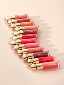
Feature image by Gabrielle Merite