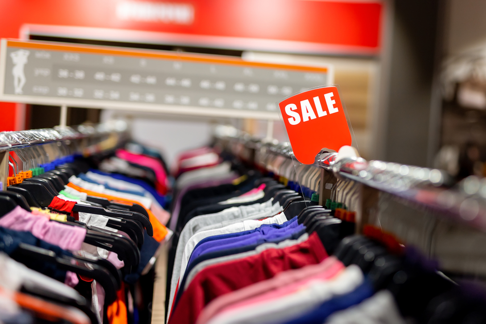

Urgency can be a powerful tool when attempting to convert visitors to your fashion eCommerce store into customers. How many times have you talked yourself out of buying something? The longer a shopper spends mulling over a product, the more likely they are to abandon it. On the flipside, when there’s a sense of urgency, and a feeling that the deal is finite, the more likely the customer is to click “purchase.”
This doesn’t simply mean putting “buy now” banners on your fashion webstore or doing a social post promoting a sale. In this guide you’ll learn seven tactics for increasing your conversion rate by creating urgency in your customers.
Cart abandonment emails
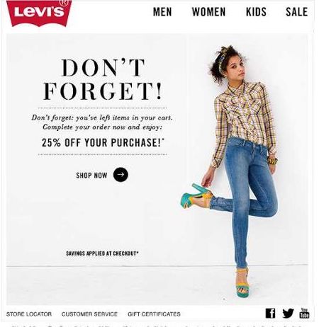
Shoppers abandon their carts for many different reasons—often it’s unexpected shipping costs, a faulty discount code or a slow-loading page. While you should try to mitigate all of these things in an attempt to decrease your cart abandonment numbers, you should also always follow up with customers who do abandon their carts. Because more often than not, they are still interested in your product. A well-crafted cart abandonment email can be the difference between closing the sale and having that incomplete order remain. Convey urgency in a short and friendly email, with a subject line like “Get your favorite top before it’s gone!” or “<Name>, you forgot something!” Avoid anything that pushes too hard or is too vague, like “Limited time only” or “Last chance.” You can also instill some curiosity in your subject line and email copy—“I think you left something…” is a good example. Shorter is better, and a little personalization goes a long way to developing great relationships with your customers. Levi’s does an excellent job with their simple, clean reminder emails.

Limited-time sales and discount codes
Why do you think your inbox is constantly flooded with limited-time sales and discount codes? Because they work! These time-sensitive initiatives are a no-brainer for creating a sense of urgency in your customers, and almost seem to create a ticking clock in their minds. If someone is interested in your product or service and sees an end date or expiration date for a discount code, it’s a trigger that compels them to make up their mind on whether or not to purchase. A deadline is a powerful incentive to action. Help your customers make up their minds by giving them a time limit.
Timers or countdown clocks for deals or carts
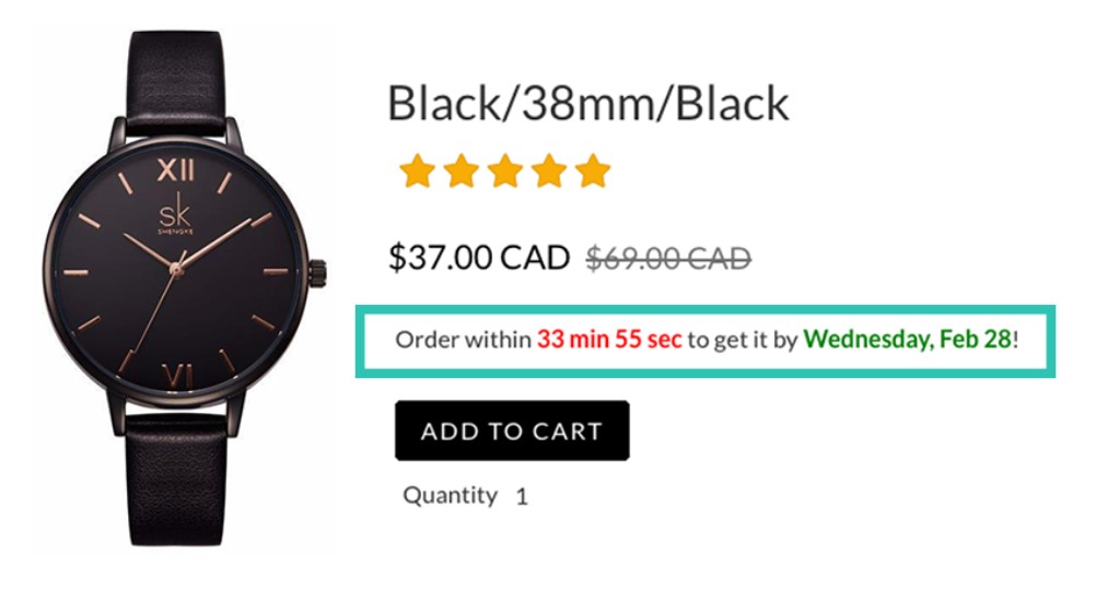
While on the topic of time limits, let’s discuss countdown clocks. Provide a striking visual element that ties in nicely with your limited-time sales and discount codes by adding a timer to carts, or countdown clocks on your product pages. This reinforces your deadline, and provides a strong prompt for action. As time ticks by the sense of urgency to buy is only going to increase. Your timers or countdown clocks don’t have to indicate end of sale times, either. They could also be used to indicate cut-off times for next-day delivery, or a more personalized offer. Amazon has an excellent example of a countdown clock.

Tap into shoppers’ FOMO
People assign more value to things that they perceive to be in short supply. Shoppers can be enticed into acting fast if they think there’s a chance they’ll miss out. Tap into this FOMO, or Fear Of Missing Out, by creating a sense of scarcity. High fashion naturally does this by producing smaller runs at higher price points, creating a limited range and therefore competitive market for their product. But brands with larger runs or less-limited ranges can still create urgency by releasing smaller batches at a time. A message on a product page conveying the limited nature of stock available can be enough to drive more conversions, as the sense of urgency to buy is increased. “I better buy it now, while my size is still in stock!” they’ll say. No one wants to be the one who missed out on a coveted item because they took too long to make their mind up. The same can apply to a service, as well, if you communicate that you can only take on a certain number of clients at a time.
Ensure your offer is relevant
Urgency will only work if the product or service in question is one that people want. If your customers are expressing demand for particular styles, sizes or products, be sure to highlight these on your homepage. Trying to repeatedly push old products that haven’t moved well will only make your brand look tired and defeated. Give your customers what they want and remind them why they were interested in you in the first place! The same applies to special offers—pay attention to what customers are saying in your reviews and social media. If there are requests for cheaper or easier shipping or bundle deals, consider offering that as a way of increasing urgency. Shipping costs being too high was shown to cause 63% of cart abandonment in a study by Statista. So give your customers what they want, because after all, urgency is about amplifying existing feelings of wanting something, not creating them out of nowhere.
Make returns easy
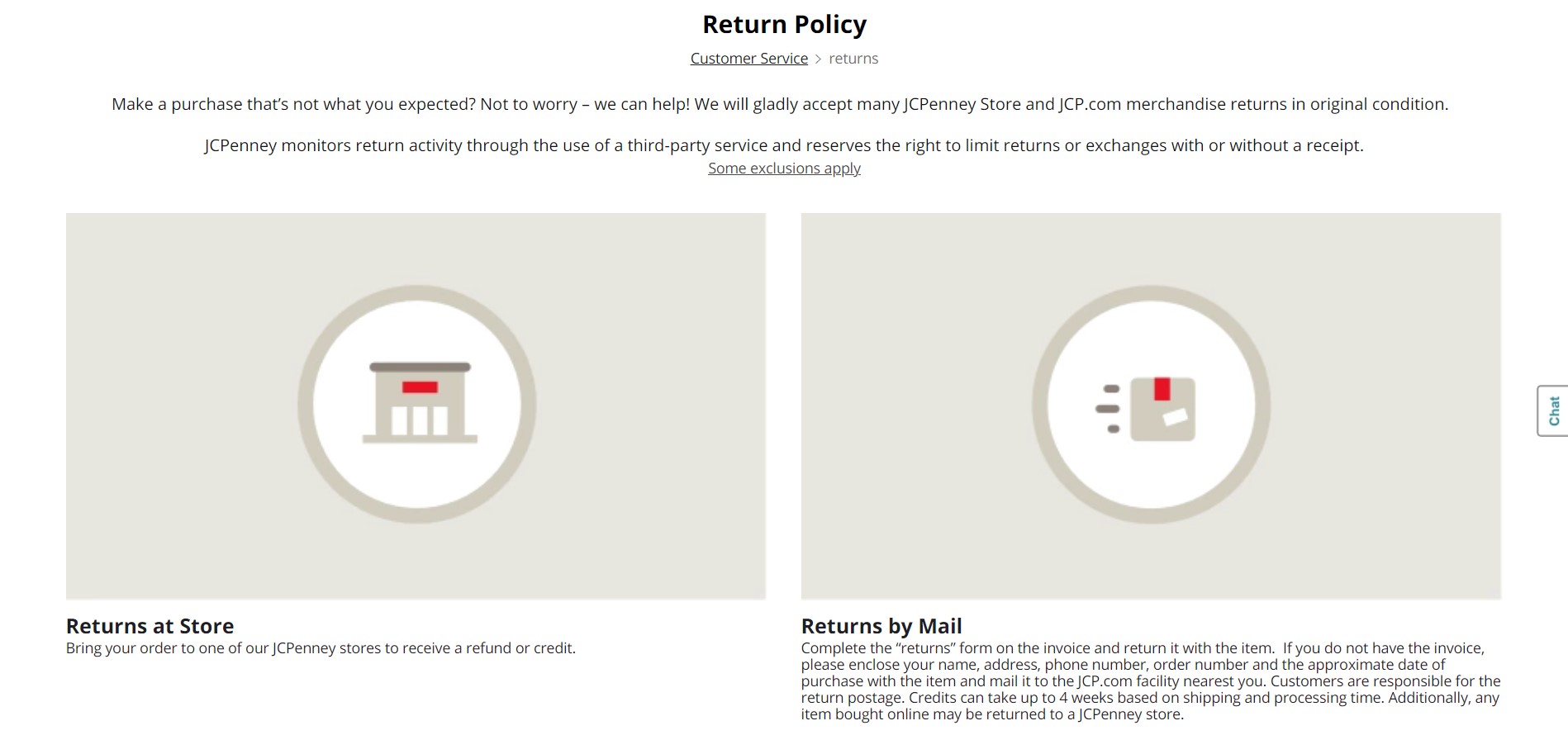
One of the number-one concerns for online shoppers is that they’ll be stuck with something that doesn’t fit or isn’t exactly what they were expecting. While you can’t always make everyone happy all of the time, you can certainly try by being as upfront and honest about your products as possible, and by providing an easy way for items to be returned for a refund or for store credit. Whichever of those options you choose, it’s imperative for you to make this clear before your customer well in advance of the checkout page. Get your customer on your side and have them quickly clicking “purchase” by making returns easy. JC Penny has an excellent example of a clean and straightforward return policy page.

Use warm colors
Green doesn’t always equal go. Sometimes you need to opt for a different color scheme, and those times are when you need to increase urgency. Red, yellow and orange have all been said to help in this instance. A study by Hubspot found that a red call-to-action button performed 21% better than a green button. Of course it pays to test this theory with your own website and audience, and not all audiences are created equal—perhaps Hubspot’s audience had a personal preference for red. It should also be mentioned that customized colors are key. Work with your brand’s existing color scheme, and if red doesn’t suit it, try something else similar.
Conclusion
Ultimately, urgency is a tactic to be used in moderation. Don’t employ every trick in the book all at once, or you’ll risk driving your customers away. Help them take you and your offers seriously by employing a measured approach. Through trial and error you will find the urgency tactic that works best for you and your customers. To learn more about how to improve your onsite promotions and messaging and other eCommerce marketing tactics, contact us today.
Get in Touch
Connect with one of our experts today to discuss your eCommerce needs!
Contact Us


