It was going so well — so what happened? Many copywriters get off to a wonderful start: The headline is compelling, the body copy is benefit-filled, but then comes the call-to-action and the whole thing falls apart.
Why? It could be a dozen different reasons, but one of the most common I’ve seen is that the call-to-action doesn’t fit the target audience.
What Is A Call-To-Action?
Call-to-action phrases (those final words that inspire your customers to take an action — usually to make a purchase) can be verbal or graphic. In copywriting, however, we use a call-to-action in writing.
Calls-to-action are not universal. Just like headlines, sub-heads, and body copy, a call-to-action in writing needs to be as specific as possible. It should also match the communication style of your customer profile.
To me, effective call-to-action phrases are more than just the simply “order today” or “click here now.” Yes, those play a part, but it takes more to motivate buyers.
Let’s look at some call-to-action phrases with examples to find out how and why they work.
Langtry Manor: Website Call-To-Action Example
 This site represents an old English manor that is available for (among other things) weddings and receptions. Their branding positions them as a very upscale, exclusive, highly sought after location for brides around the world.
After going over the benefits of using the inn for a wedding and/or reception, the call-to-action comes into play. Notice how there is more than the simple “contact us today” statement.
_________________________
Because of the historically romantic setting and immense popularity of Langtry Manor among brides worldwide, our schedule becomes filled quickly. We recommend you contact us for additional information or to arrange for a viewing of the hotel as soon as possible. This will help to guarantee a reservation for your preferred date.
_________________________
See how the call-to-action fits the audience? The copy doesn’t stop in the middle of romancing the bride in order to scream, “Dates are being booked as we speak! Call us today before your wedding date is gone forever! Don’t let some other bride get the jump on you! Pick up the phone now!” This audience would run for their lives if they read that copy
Tai Chi Flow: Website Call-To-Action Example
 This site actually had three calls-to-action (CTA), one for each segment of their target audience: those seeking wellness; kids; and pregnant women. See how each CTA struck an emotional nerve with a specific group.
Call-To-Action Example #1
The ancient masters practiced Tai Chi faithfully and lived a life filled with peace and wellness. The moment you order your Tai Chi Flow for Everyone video you’ll vow to never be without it again!
Call-To-Action Example #2
Your child will receive the same benefits you receive, but through a video created especially for him/her. Teachers, moms, and dads agree, Tai Chi kids share some pretty amazing qualities. Order Tai Chi Flow for Kids today.
Call-To-Action Example #3
Designed according to the American College of Obstetricians and Gynecologists guidelines, Tai Chi Flow for Pregnancy is the safe way to receive the benefits of an aerobic workout… even if you are sitting down. Order Tai Chi Flow for Pregnancy today.
All of these call-to-action phrases examples appeal to the specific wants, needs, and desires of that individual segment.
That’s what an effective call-to-action in writing is all about. You don’t lose your connection with the audience at the end. Instead, you maintain that emotional bridge all the way until they click the buy button.
In your CTA, tell your customers why they should buy. Let them know what will happen when they buy. Give them some end results to look forward to. And do it all with the same consciousness you had when writing the rest of your copy.
11 Compelling Elements of Effective Calls-To-Action
1. Size: If your call-to-action is too small, your audience may not see it. If it’s too big, it may be overpowering. It may even distract your visitors from other vital information, such as promotions and product news. Your CTA should achieve balance: just the right size in relation to all the other elements on your website.
2. Images: Your imagery should reflect your brand. For example, if your brand signifies “elegance,” you won’t want to show images that convey the exact opposite. Plus, you’ll always want to choose imagery your prospects can relate to. Are your customers serious athletes or “gym rats”? Show them action images featuring sports models with visible muscle tone. Are they familiar with high-end electronics? Show specific, relevant images they’ll take seriously — not generic stock photos (which they won’t).
3. Powerful Copy: Every call-to-action should include short copy telling your audience exactly what to do. Use action verbs: Buy, Download, Sign Up. Get. Let your prospects know what will happen when they click
4. Colors: Choose contrasting colors that complement — yet stand out from — the rest of your website. Your CTA color scheme should command attention without clashing with everything else.
/* .tcb-flex-col { padding-left: 0px; }[data-css=”tve-u-15ffce478e557d”] { padding: 10px !important; margin-bottom: 0px !important; }:not(#tve) [data-css=”tve-u-175ffce478e558d”] button { font-size: 22px; border-color: rgb(57, 60, 59); background-image: none !important; background-color: rgb(216, 68, 97) !important; }[data-css=”tve-u-105ffce478e5586″] { font-family: Verdana, Geneva, sans-serif !important; font-size: 26px !important; color: rgb(216, 68, 97) !important; }:not(#tve) [data-css=”tve-u-95ffce478e5585″] { line-height: 1.5em !important; }:not(#tve) [data-css=”tve-u-115ffce478e5587″] { line-height: 1.5em !important; font-size: 1px !important; }}@media (max-width: 767px){[data-css=”tve-u-195ffce478e558f”] { text-align: center; background-image: none !important; }[data-css=”tve-u-25ffce478e557e”] { background-image: none !important; }[data-css=”tve-u-55ffce478e5581″] { padding-top: 0px !important; }[data-css=”tve-u-45ffce478e5580″] { background-image: none !important; margin-bottom: 0px !important; }[data-css=”tve-u-75ffce478e5583″] { background-image: none !important; }[data-css=”tve-u-15ffce478e557d”] { padding-bottom: 20px !important; margin-bottom: 0px !important; padding-left: 10px !important; padding-right: 10px !important; }[data-css=”tve-u-85ffce478e5584″] { padding: 10px 0px !important; background-image: none !important; }[data-css=”tve-u-165ffce478e558c”] { max-width: 336px; margin-top: 0px !important; padding-top: 0px !important; margin-right: auto !important; margin-left: auto !important; background-image: none !important; }}
/*]]>*/
/**/
These 5 Words Can Make or Break Your Marketing Results
Ready for more clicks, increased engagement & better results from all your marketing? It’s time to beef up your short copy. Discover 5 words that add power & persuasion to headlines, titles, subject lines, bullets, calls-to-action and more.

I understand that I will also receive weekly articles & videos plus periodic discounts, product notices & more. I can unsubscribe at any time.
5. Forms: Your call-to-action can take several forms. You can use a button or a similar graphic, such as a bar or lozenge. You can use a sign-up form — for instance, at the end of a blog post. You can include a CTA invitation to connect on social media. It all depends on what you’re trying to accomplish.
6. Placement: Usually, it’s best to place your CTA in multiple locations. That way, your audience has several opportunities to click through.
7. Know What You Want: Write down your goals — what you want your audience to do.
8. Know What They Want: What does your audience need? What problems do they have that you can solve? What dreams can you help them fulfill?
9. Be Specific: Make lists of specific objectives — both yours and your customers’. Keep these lists handy so you can consult them whenever you need to.
10. Use Vocabulary That Works For Your Audience: Never talk over your customers’ heads. Never talk down to them, either. Use terms they can understand and relate to. Include current jargon to more closely relate to your audience when it’s appropriate.
11. Appeal To Their Aesthetic Sense: Use colors and designs that fit your customer profile and complement the rest of your website.
35 Call-To-Action Phrases (Examples)
When you want a specific phrase to entice and encourage people to take an action such as clicking a button to start a trial, make a purchase, download a freebie, join a group, or anything else, mix and match these 25 call-to-action phrases for an unlimited number of options:

- Get It Now
- Yes! I Want It!
- Get Instant Access
- Get the Free ______
- I Need the ______
- Unlock the ______
- Grow My List Now
- Reserve Your Seat Now
- Join Other Smart _____
- Claim Your _______
- Book Your _______
- Enroll Now
- Give Me Results In Just ____ Days
- Join for a Free Month
- Request To Join Now
- Start Your 10-Day Trial Now
- Give [Product/Software] A Try
- Begin Now
- Send Me Weekly/Daily Specials
- Follow the Magic
- Give It A Try
- Don’t Miss Out
- Don’t Procrastinate
- Get Details & Order Now
- Find Out More
- Discover Your New _____
- Grab the Template [Or Whatever]
- Share Your Thoughts
- Tell Us What You Think
- Let Us Know How We’re Doing
- Download Now
- Open Your Worksheet [Or Whatever]
- Take Your Worksheet
- Get Your Gift
- Learn More
How To Create Perfectly Designed Calls-To-Action
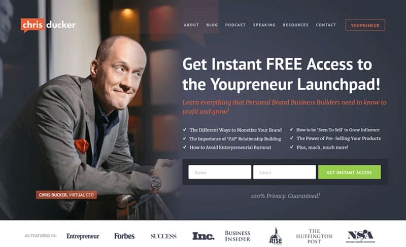
Whether in a blog post, on a web page, in an email, or somewhere else, it takes a good deal of work to create a call-to-action design that is attractive, eye-catching, and conversion-worthy.
With complex layouts plus the technology to link your form to your list service (I use Active Campaign, but AWeber is nice, too) with the proper tags and follow-up automations, you could need help.
Depending on what you’re going for, you might need to enlist the help of a graphic designer or purchase a WordPress plug-in or two to get the look and functionality you need.
Or not!
My design preference is to use Thrive Themes for web pages and landing pages. (It’s also awesome for blog posts.) With its built-in call-to-action creator, you simply drag, drop, and tweak to have professional-looking calls-to-action that are proven to work.
Here are several call-to-action examples with pictures.
How Can I Improve My Call-To-Action?
In a word: Testing.
It’s practically impossible to predict which call-to-action will work on any given page or form. That’s why doing a few tests can help you determine which one will perform best long-term.
What can you test? The list is endless, but here are a few of the most popular tests that can bring big results.
- Graphic Images – Should you include your logo or a graphic related to your offer? Only a test can reveal what works best.
- Solid Backgrounds vs. Pictures – Will a solid-color background work best or will a photograph used as the background produce better engagement? Give each a try and see.
- Positioning of Graphics/Pictures – Where on the page/form is the best place for your graphic or pictures? Let your visitors decide when you set up an A/B test.
- Headlines, Bullet Points, & Button Copy – These short snippets of text are vital to getting high conversions. But what type of copy will work best? Test and see!
- Button Colors – Does your CTA button stand out enough? Is the color complementary, but noticeable? Test several to find out.
- Button Shapes – What shape will your audience respond best to: square, oval, rounded rectangle? Give each a go.
- Form Fields – The more fields you have, the fewer people will sign up via your form. But which fields will your specific audience be comfortable with? A test can show you.
- Form Placement – Should your form be at the top or bottom of your page? Perhaps on the left side or right side? Testing can determine best placement.
- Form Colors – Forms that blend into the background are rarely successful. Test several color options to find the one that works best.
Overall, your goals for creating powerful calls-to-action that get results should be to:
- Make the design obvious, so it’s easy to find.
- Relate to your audience; engage and excite them.
- Simplify the call-to-action so they instantly know what to do next.
- Clearly communicate the offer. (Trying to be clever often backfires.)
The Resources & Tools I Use For Calls-To-Action
Have questions about calls-to-action? Talk to me below!
Other Related Posts You’ll Love
How to Get Optimal Conversions Through A/B Split Testing
How to Boost Online Conversions Using Heat Maps and Scroll Maps
