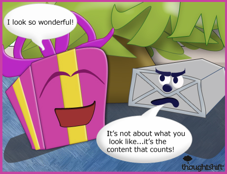
Oh, what a pretty site. What does it do? I don’t know how many times I’ve said these words. When someone shows me a flashy new site they’ve been working on that is all looks and no substance my heart sinks and I die a little bit inside. Well, maybe that’s stretching it a bit – but it’s a sad state for a website that wants to perform well with users and in search.

You can have the most beautiful dynamically designed and technically sound website around, but if there’s not a solid purpose to the site illustrated by good content – then it’s of no real value to the user.
It doesn’t matter what the site is, even if it’s an artsy site that exhibits boutique fashion in a minimalist sort of style it can be quite a frustrating journey for the user if the intentions of the site and it’s values aren’t illustrated clearly through good content.
Make sure that your site has the values you believe it should have plain to see on it – because the user won’t be able to read your mind. Always remember that content is king, and it’s what counts as the real structural integrity of the site. Pretty colours and amazing design is all well and good, but it really needs to be combined with good content to have any meaningful impact.
Here’s todays illustration for the 9th Day of Christmas, make sure you come back to the ThoughtShift Blog tomorrow to check out the next one!


