Building your online store and looking for design inspiration? There are so many websites out there, yet many begin to look and feel the same—especially when you start looking at ecommerce sites.
While it’s tempting to let your imagination run wild or focus solely on what will drive conversions, the best website designs strike the perfect balance between creativity and functionality.
“Best web design” lists like these often feature award-winning websites that are visually fascinating but sluggish and serve a single purpose. We wanted to flip the script a bit—that’s why our list will only feature beautiful, functional websites that power successful businesses. Fundamentals and flourish: these sites are an inspiration on both fronts and are as easy to use as they are easy on the eyes.
The best designed websites that power equally creative businesses
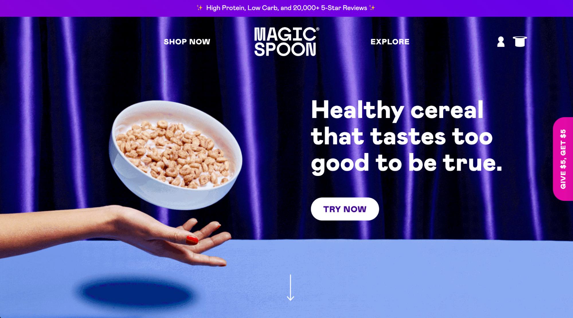
1. Magic Spoon
- Category: Food and beverage

Magic Spoon’s splashy homepage is so slick it almost feels like sleight of hand—you’ll find yourself spellbound by the design and forgetting that you’re shopping for cereal. Proof positive that there are no boring products, only boring brands, Magic Spoon continues to pour on the charm with illustrated packaging, a scintillating color palette, and delightful details behind every click and scroll—all without being overwhelming. Bran flakes, eat your heart out.
Why Magic Spoon converts
According to Orbit Media’s web design standards, 80% of brands have a value proposition at the top of their homepage (we also call this “above the fold,” which refers to the area of the screen a user sees before scrolling down). For Magic Spoon, that value prop is “Healthy cereal that tastes too good to be true.” It’s simple, yet direct and impactful. It sells delicious cereal that’s also good for your health. This is also an important differentiator, as many healthy cereals don’t taste great, and many delicious cereals are loaded with sugar.
2. Meow Meow Tweet
- Category: Skincare

Meow Meow Tweet sells organic vegan skincare products with a low-waste commitment. A visit to the brand’s website shows simple, straightforward product photography, accompanied by touches of fun illustrated graphics and complementary copy. It also has fun content on product pages to educate shoppers about its products, how they’re consciously made, and how to use them.
Why Meow Meow Tweet converts
Meow Meow Tweet makes it easy for shoppers to buy its products, both online and in person. It has a section in its main navigation dedicated solely to helping people find its products for purchase. On this page, people can browse physical and online locations all over the world.

3. Velasca
- Category: Apparel, footwear and accessories

Velasca sells Italian-made footwear, belts, wallets, socks, bags, and select apparel items for men. It targets a slightly sophisticated but humble customer, an identity reflected on its website. A quick scroll will show you large aspirational lifestyle photos. In between shots, animated illustrations add approachability and flair to the design, as well as a bit of interactivity to keep things interesting. It strikes a balance between serious and playful.
Why Velasca converts
Velasca validates its brand and products by way of showing what others have said about it. Its homepage features a quote from the press praising Velasca, as well as logos of well-known publications that have written about its products. This gives Velasca’s claims about its own products credibility and instills trust in potential buyers. Velasca also sprinkles in customer testimonials to show a variety of voices.

4. Knowell
- Category: Health and wellness

The smiley face is Knowell’s main visual identity—you’ll see it sprinkled throughout their website in graphic illustrations. Hover over the main navigation bar at the top and you’ll see the words transform into a smile shape too. Though Knowell’s website and branding are playful and fun, clean lines and simple layouts bring a level of sophistication to the nutritional supplement brand. With a healthy balance of illustration, photography, text, and blocks of color, the Knowell website is a pleasure to both look at and engage with.
Why Knowell converts

Knowell uses consistent graphic treatment to indicate buttons and clickability. While menu navigation items animate into the shape of a smile, CTA “buttons” are actually arrows.

With this design approach, Knowell trains website visitors to click on arrows. Once they get to the product page, the arrow is a bit bigger, with a large Buy Now next to it.

5. Allbirds
- Category: Footwear and apparel

Though Allbirds sells shoes, its website features more than just footwear. High-quality photography, curated product collections, a store locator tool, and inspirational stories about sustainability are sprinkled throughout. Even if you’re not actively shopping for shoes, you’ll enjoy Allbirds’ attention to detail and commitment to quality—in both its products and the content on its site.
Why Allbirds converts
As consumers increasingly gravitate toward environmentally conscious purchasing habits, it’s becoming more important to showcase exactly how and why your brand is sustainable if you’re making that claim. As such, Allbirds gives users a look into how its sneakers are made. A visually appealing teaser video appears on its homepage—a click takes browsers to a page that shows the manufacturing process, including material sourcing and information about its Forest Stewardship Council certification, which adds credibility to its claims.
6. Gymshark
- Category: Apparel

Gymshark has a clean, slick website that showcases its athletic apparel. Gymshark is more than just a clothing brand—it helps its customers “perform at their max” and unlock their full potential, especially when it comes to fitness. Notice how the lifestyle images are accompanied by a digital fabric swatch to show the detail in the design of the clothes.
Why Gymshark converts
Gymshark sells to an international audience, so it knows it needs to accommodate a wide range of payment options—and ensure security and compliance along the way. One payment option it provides is Klarna. Klarna is a direct and secure payment method for merchants in Austria, Germany, and Sweden that offers multiple payment options for Shopify Payments. It also offers gift cards, student discounts, Clearpay, and Afterpay.
7. Keap
- Category: Candles

At first glance, you might think Keap is an outdoor photographer’s website. The ecommerce site is beautifully and simply designed, with a heavy emphasis on nature-inspired imagery. Keap sells sustainably made candles of scents inspired by the outdoors. It has an Approach page that takes people behind the scenes, in an equally beautifully executed video, to see how its candles are made.
Why Keap converts
The copy on the Keap website is just as compelling as the imagery. The main CTA button on the homepage states “Start your scent journey” instead of something generic like “Explore products” or “View candles.” The language it uses complements the imagery, nodding to the journey users take when they visit the website and see the beautiful photos. Likewise, users will think Keap’s candles will take them on a similarly engaging journey—and those who are interested are likely to make a purchase.
8. Harper Wilde
- Category: Intimate apparel

Harper Wilde uses bold fonts to mirror its striking branding, which aims to challenge the status quo selling bras for women. You won’t find any pink or sparkles here—and rather than perfectly Photoshopped models, Harper Wilde features its products on women of all colors, shapes, and sizes. It also has an online measurement guide to help shoppers find the best size for them.
Why Harper Wilde converts
Harper Wilde is a brand that isn’t afraid to take a stand. Not only has it taken advantage of corporate social responsibility (CSR) as a branding tactic, it’s also tapped into current events as a conversion tool. In response to Texas abortion laws, it launched a limited edition bra stating exactly what it thinks about those laws—and donating to causes fighting such legislation.
9. Endy
- Category: Mattresses

While most mattress and sleep-related brands play it safe with their color palette and design, Endy looks to make a bold statement. The Canada-based mattress e-tailer uses the industry-standard blue but mixes it up with a bright pink logo, headlines, and CTA buttons. A click over to its product pages gets browsers up close and personal with the product—animated GIFs, detailed product images, and videos show off the most impressive features. Competitors shouldn’t sleep on Endy.
Why Endy converts
Nearly a quarter of ecommerce sites have an email signup in their footer, according to Orbit Media’s web design standards. Endy is one of them. A bright pink block pops up from the bottom of the page prompting users to subscribe.

10. Guava
- Category: Baby and child gear
- Caught our eye: TK
- Final verdict: TK

The Guava website is impressively engaging—especially surprising considering the fact that it only sells three products. High-quality photography, clean design with lots of white space, and easy-to-read web copy make it an approachable site—particularly important for a busy parent.
Why Guava converts
Guava knows its differentiators and puts them right at the top of its homepage. Rather than focusing on features, it highlights the end result or benefit for users: lightweight, portable, fast fold, safe, and durable. These are all key qualities that most parents look for, especially in products for their children. Plus, they promise free shipping and free returns to ease any lingering hesitation.
11. Bison Coolers
- Category: Outdoor accessories

The Bison Coolers website sells ice chests, drinkware, and other gear to keep your food and drinks in prime condition while you’re enjoying the outdoors. And its website is just as powerful as its products. Eye-catching headline copy and brand voice to match, beautiful background photography, and graphic design that keeps the site simple yet impactful.
Why Bison Coolers converts
Bison Coolers products are made in the US—and the brand proudly touts that throughout its site. It even has a whole page dedicated to the topic. As many as 70% of respondents to one survey say they want products that are made in America, and 20% of those are willing to pay more for said products. Bison Coolers taps into this clever conversion opportunity, highlighting this characteristic of its product.
12. Heraldic Jewelry
- Category: Jewelry

For Heraldic Jewelry, the beauty is in the details—both for its products and for its website design. Rather than the standard static homepage banner image, Heraldic has a series of amazingly shot videos that show off how its handcrafted pieces are made. And that’s just the start—scrolling and clicking around on the site will reveal even more “how it’s made” content, reiterating one of the brand’s most important value propositions.
Why Heraldic Jewelry converts
Yes, the website is beautiful and arguably not super conversion-driven. There’s no Buy Now button above the fold, after all. And shoppers have to request a consultation to get a quote for their design, so it’s not a straightforward or simple purchase process. But someone shopping for a special piece of jewelry—a one-of-a-kind family crest, no less—will likely do more investigative work into the quality of the piece.
13. Wunderground Coffee
- Category: Food and beverage

Like many of the other best website designs on this list, Wunderground makes use of illustration to incorporate personality and fun into its branding. The mushroom coffee seller also uses illustration to highlight benefits of its products and educate shoppers on what exactly mushroom coffee is and why they should care.
Why Wunderground converts
Some products are available at discounted prices, so Wunderground shows the reduction on product collection pages. This tactic drives users to product pages for the discounted items, as there’s an anticipated deal at the destination.

14. BLANQI
- Category: Maternity and women’s apparel

BLANQI sells maternity wear and accessories on a beautifully designed website. Simplicity is key for BLANQI, as it focuses on subtle pops of color, sophisticated white fonts, and blown-up imagery. Though understated, the photography and website design are distinctly BLANQI.
Why BLANQI converts
BLANQI knows its audience, as evidenced by its email signup, for example. Here, the brand asks users to give a small bit of information about themselves. In exchange, they’ll receive more relevant content—and BLANQI has a self-segmented email subscriber list.

15. SlideBelts
- Category: Accessories

SlideBelts sells—you guessed it—belts. And though at first glance it may seem like one of your run-of-the-mill luxury brands, further exploration reveals otherwise. SlideBelts sneaks interactivity throughout its site in different ways. Its homepage arrow animates to encourage users to scroll down the page, and its About page takes the cake when it comes to creativity.
Why SlideBelts converts
SlideBelts doesn’t use interactivity and motion graphics just to look good. It also uses these features to boost conversions. Pop-ups and sliders highlight the product, its features, and the benefits for the end user. Who knew belt shopping would be so fun?
16. Viberg
- Category: Footwear

Viberg is a brand that doesn’t try too hard. Instead, it lets the quality of its products do the talking. And that’s also the case when it comes to its approach to its website design. Rather than incorporating CTAs, content blocks, and interactive experiences on its site, it focuses on blown-up product imagery that speaks for itself.
Why Viberg converts
At first glance, it might be difficult to see the path to purchase. But in between each large featured image, Viberg includes a carousel of products that users can browse. They switch off between the beautiful imagery and the product-oriented carousels that take users to product pages. It seems Viberg trusts that its average user already has a certain level of brand buy-in when they visit the site, so it makes the path to purchase short and as frictionless as possible—simple, like its branding and site. Viberg also uses product pages to educate users further.
17. Kettle & Fire
- Category: Food and beverage

Kettle & Fire’s website makes bone broth exciting. Above the fold, you’ll see a fairly typical layout for an ecommerce website. But a few scrolls and clicks later will show there’s much more to it than that. Kettle & Fire has images of vegetables—key ingredients in its product—floating throughout the site. It also uses fun slogans like “yummy in the tummy” and “warm your soul” to bring out the fun factor.
Why Kettle & Fire converts
Kettle & Fire sells all kinds of bone broths. The average shopper may not know the differences, and choosing one can be overwhelming enough to send people off the page. But Kettle & Fire is prepared—it has a quiz shoppers can take to find out which bone broth product is right for them. This also gives the brand key information about the people visiting its site, which it can use to inform key business decisions.
18. ThirdLove
- Category: Intimate apparel

ThirdLove sells bras, underwear, and sleepwear to women on its beautifully designed website. There’s a perfect balance between lifestyle photography and text, and the design and copy alike are super approachable. A visit to ThirdLove’s “fitting room” will take users through a quiz to help them find the right size and fit. Even the navigation menus reveal beautiful imagery when you hover over them.
Why ThirdLove converts

While many ecommerce sites simply have an email signup in exchange for a discount, ThirdLove skips the discount and instead gets specific about what subscribers should expect. ThirdLove sends emails about limited edition products, and includes a countdown until the next drop. This approach brings some urgency and gives users an extra incentive to sign up.
Here are some resources to inform your own email marketing strategy:
19. 3sixteen
- Category: Men’s apparel

3sixteen’s photographs are so beautiful you might wonder if you’re viewing a photographer’s portfolio or an actual online store. The latter is the case for this menswear brand. Beautiful product photography is the star of this website design, with plenty of white space and a clear focus on the product.
Why 3sixteen converts
While 3sixteen may drive online sales, the website may also be a key component to driving foot traffic to its LA and NYC retail shops. And in a COVID-19 era, 3sixteen has made arrangements to allow for a more comfortable and safe in-person shopping experience. Shoppers can book 30-minute appointments where they get the entire store to themselves. Talk about a memorable experience.

20. GREATS
- Category: Footwear

GREATS also lets its photos do the talking when it comes to its website design. Rather than a lot of interactivity and hidden content, GREATS uses a straightforward approach. The brand clearly honed in on its voice, creating an approachable brand that feels like a friend. And the images show off both the product details and aspirational lifestyle shots.
Why GREATS converts
Free gift with purchase, free shipping, and free returns—these are three major advantages to shopping with GREATS. And the brand isn’t afraid to remind users of that. These are all great conversion tools for reducing hesitancy and mitigating doubt in potential customers. A free gift with a $150+ purchase boosts average order value (AOV), while free shipping can lower your cart abandonment rate. And free returns takes a lot of the risk out of the purchase for people.
21. Studio Neat
- Category: Office Products

Studio Neat makes and sells a small collection of home office products. It’s clear the brand has prioritized investing in high-quality product images. The treatment of these images is particularly interesting in the dropdown menu—they’re almost like an illustrated icon. Overall, the site is sleek, beautiful, and simple—just like the products.
Why Studio Neat converts
Studio Neat taps into the psychology behind scarcity to drive online sales. A click on “Limited” in the main navigation takes users to a page dedicated to the brand’s current limited edition product. On the page, Studio Neat includes a key conversion element: a countdown of quantity remaining.

22. OLIPOP
- Category: Food and beverage

OLIPOP’s website is clean but fun, sort of like its soda. The brand uses its site to highlight the soda’s healthy ingredients and how it’s better than most other carbonated beverages out there. Vivid colors and a strong but approachable brand voice complement its photography. With headlines like “Meet the squad” and “We’re all just bacteria baby,” it’s a fun site to browse.
Why OLIPOP converts
OLIPOP sells gift cards on its website—especially ideal for the upcoming holiday season. Plus, the gift cards are available digitally, which reduces gift card fulfillment costs and also supports contactless commerce in a COVID-19 economy.
23. Pop Chart
- Category: Art

Pop Chart sells prints and scratch-off artworks, so it’s no surprise that the design-centric brand put a lot of creativity into its website design as well. It might seem simple at first: bold fonts with a plain white background let the products and art themselves take center stage. Hover over a content block and you’ll see a bit of interactivity as the block appears 3D with a colorful “shadow” behind it. These subtle pops of fun make the seemingly simple website a lot more exciting to engage with.
Why Pop Chart converts
Pop Chart isn’t just a direct-to-consumer business. It also sells wholesale. Scroll down to the bottom of the page and you’ll see “Wholesale” in the footer. A quick click takes users to a form where they can fill out more information so Pop Chart can get back to them. Expanding into wholesale is an excellent way to drive more sales and put your brand in front of new audiences.
24. Then I Met You
- Category: Skincare

Then I Met You sells skincare products targeted at fighting acne. The website is simple yet lively, with high-quality product photography and video sprinkled in between customer reviews, and a message from founder Charlotte Cho. The website is particularly easy to navigate and read, with bold text on a simple background. Though it’s simple, there are plenty of places to click to expand for more content. User-generated content (UGC) also brings authenticity to the community-rooted brand’s website.
Why Then I Met You converts
“Jeong” is a Korean value rooted in deep community connections. Then I Met You aims to create jeong with all of its customers, not only through its products but through providing authentic community connections. It has an entire page on its site dedicated to jeong, sharing how the brand is involved in philanthropy and how customers can create jeong in their own lives. It promotes purchases by encouraging sharing through gift-giving.

25. good light beauty
- Category: Beauty and cosmetics

Spirited but understated are two great words to describe good light’s branding and website. Clean fonts with slightly subdued bright hues, along with beautiful photography. Products spin 360 degrees on the homepage in animated GIFs, differentiating what are typically straightforward images.
Why good light converts
If you look in the lower right corner of good light’s site, you’ll see a Text Us button where you might expect a live chat window. For more than three-quarters of consumers, SMS text message is the quickest way to get in touch with them. Plus, SMS campaigns have an average 99% open rate. It’s also an ideal channel for reaching good light’s audience demographic.